Summary
A powerful console that only worked with a support engineer's help
Data Product producers at Tempus use the Console to register data, which gives that data access controls, discoverability, and a defined schema. New producers, though, couldn't get through that registration flow on their own — a non-intuitive interface caused enough confusion that most people needed to read documentation or talk to a support engineer just to get started.
I designed "Studio space," a self-guided interface that replaced twelve screens with four and walked producers through each phase of creating a Data Product themselves.

01 — The problem
New producers couldn't start without help
New data producers to the Tempus Console struggled to create Data Products on their own. The interface wasn't intuitive, so most people fell back on documentation or a support engineer just to get moving — which is exactly the failure mode the goal was written against: design a self-guided interface that eliminates the need for either one.
Desired outcomes
Decreased time to publish a new Data Product
More data reaches Tempus' precision medicine library for research, faster.
Increased user satisfaction with the Console
Encouraging more users to stay on-platform and contribute to the library.


02 — Process
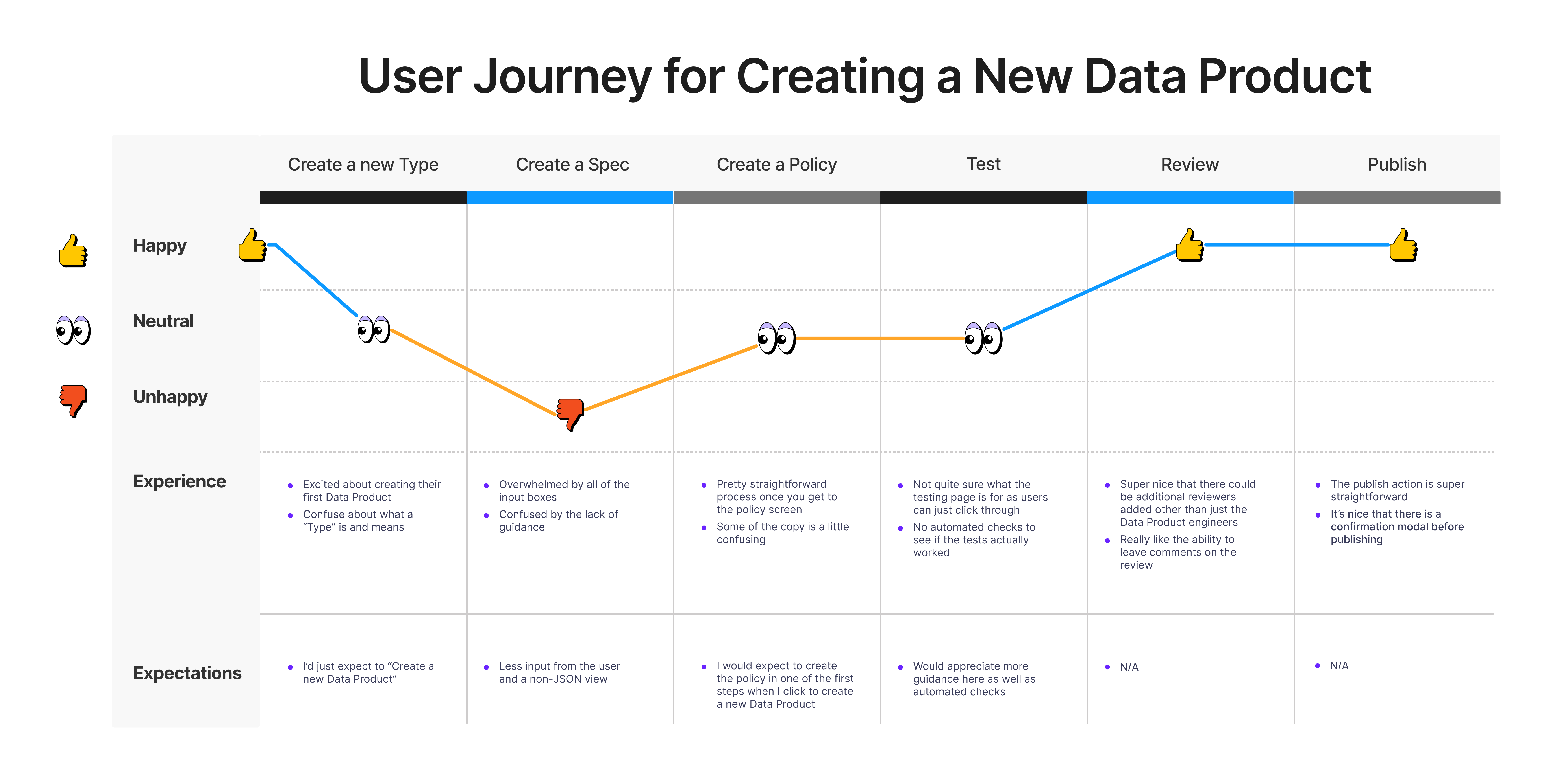
Mapping the journey, then reframing the problem
I started by mapping how a producer actually moves through creating a Data Product today, then turned what hurt into a set of design bets and a redrawn target flow.
How might we
Design an easy entry point for new users
Decrease the cognitive load when creating a spec
Prompt policy creation when users define the Data Product
Target user flow
Four phases, redrawn from the ground up:
- Define — name, description, version, specification (major area of improvement), and access policy (major area of improvement).
- Create data in the alpha and beta environments.
- Data consumers check that the data matches what they expect.
- Publish the Data Product to produce data in production.
03 — Decisions
Three moves that took twelve screens down to four
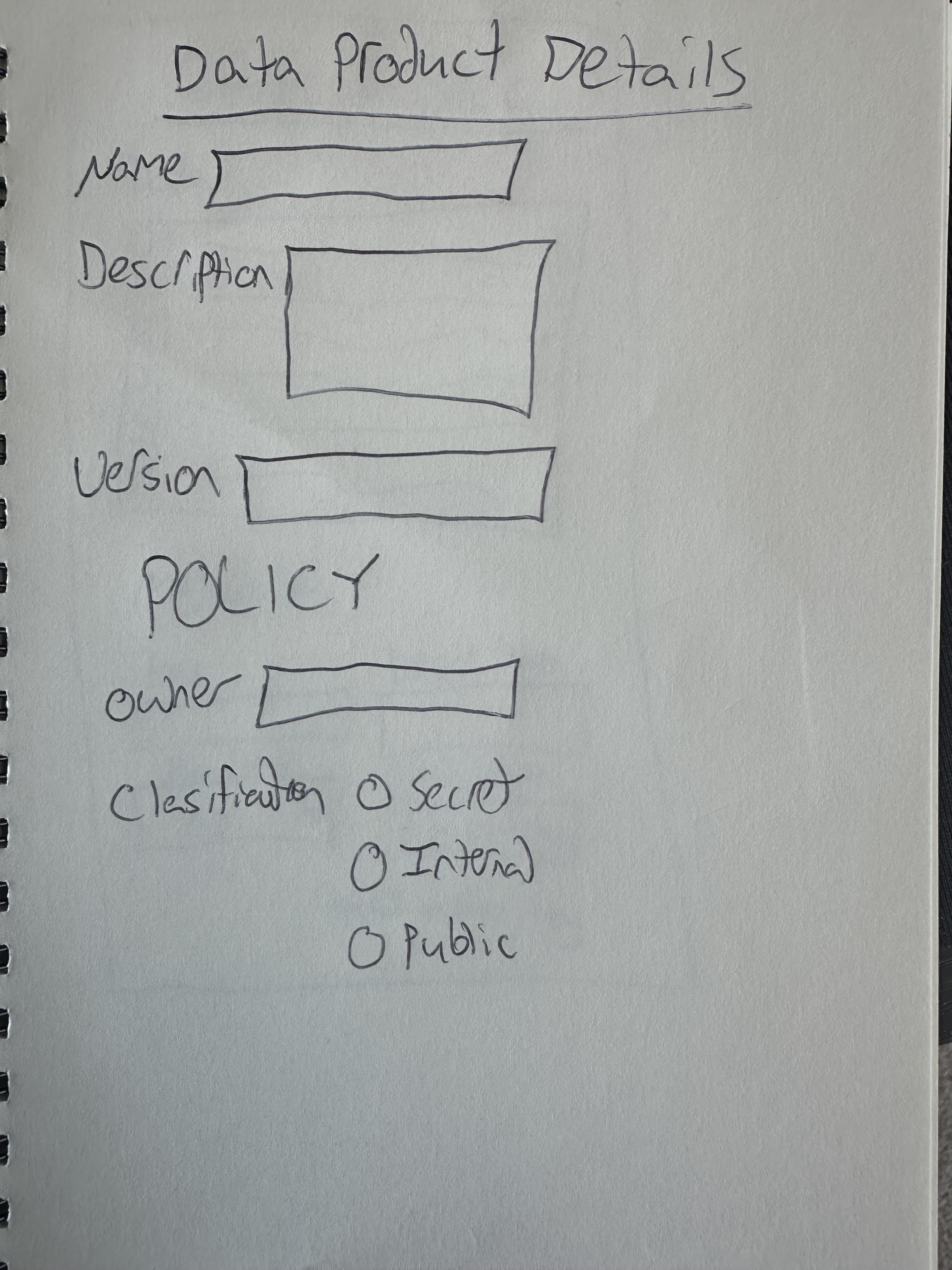
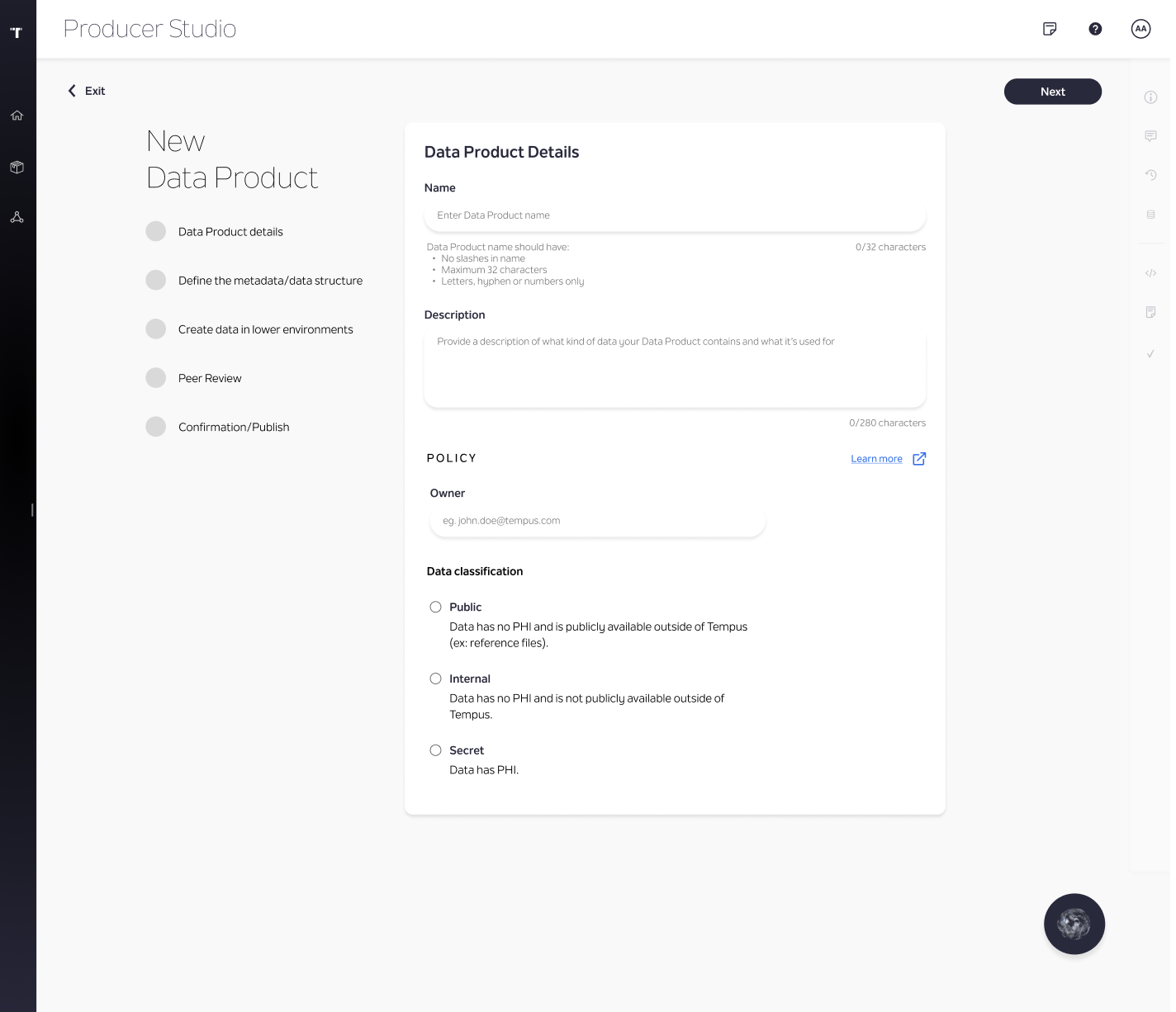
Move policy creation into the first step
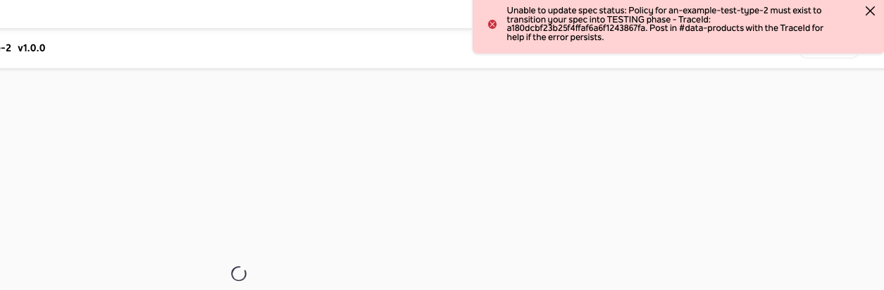
In the old flow, the only way to know a Data Product needed a policy was an error — and the error didn't explain what to do about it. Sketching pushed that decision to the very first screen, so producers see it before they can get stuck on it downstream.
Split the spec into tabs, not one long form
The old spec view packed a lot of features and capabilities into a small space, with little indication of what any given field meant. Sketching tried breaking those fields apart before anyone touched Figma.
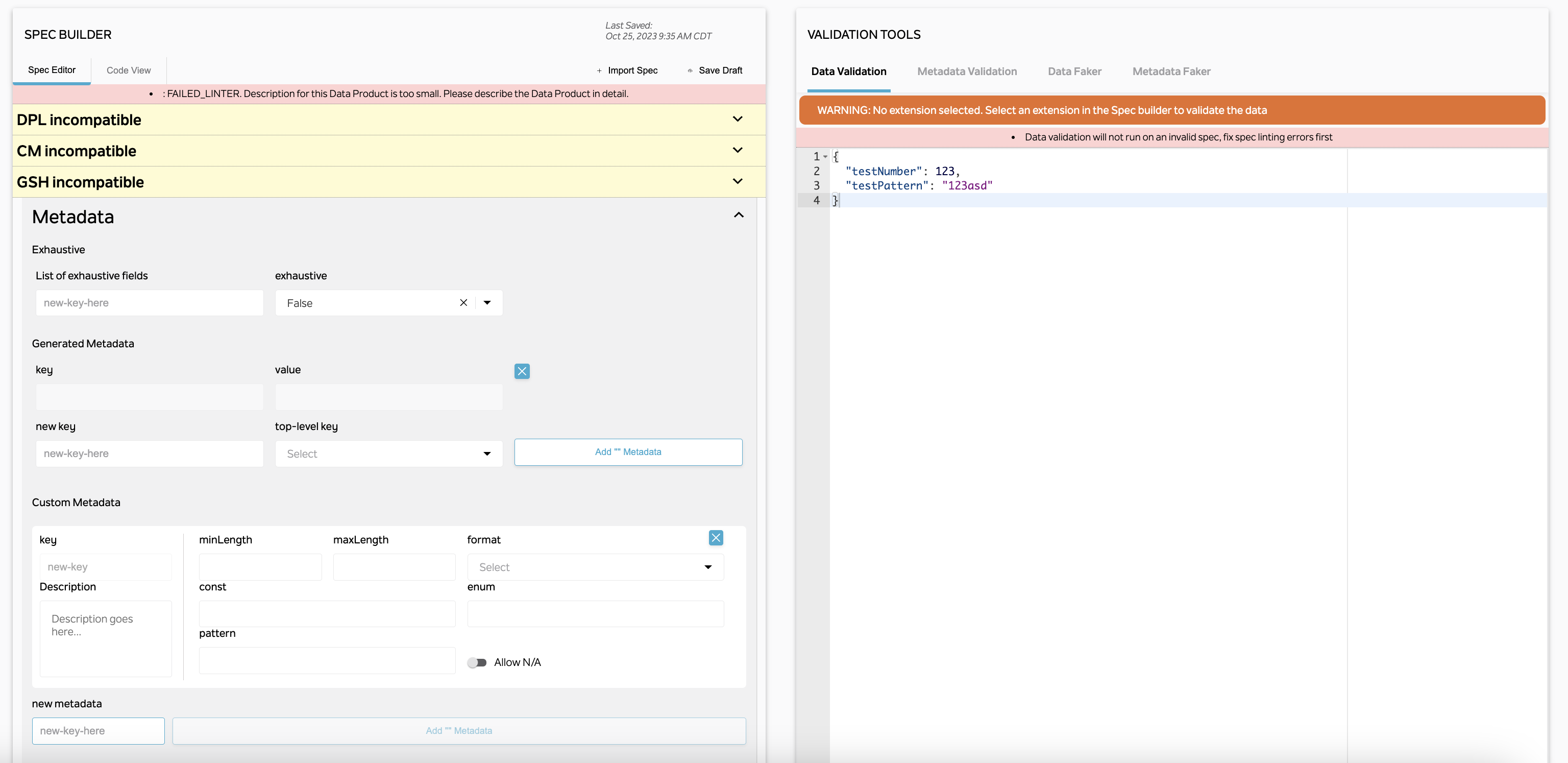
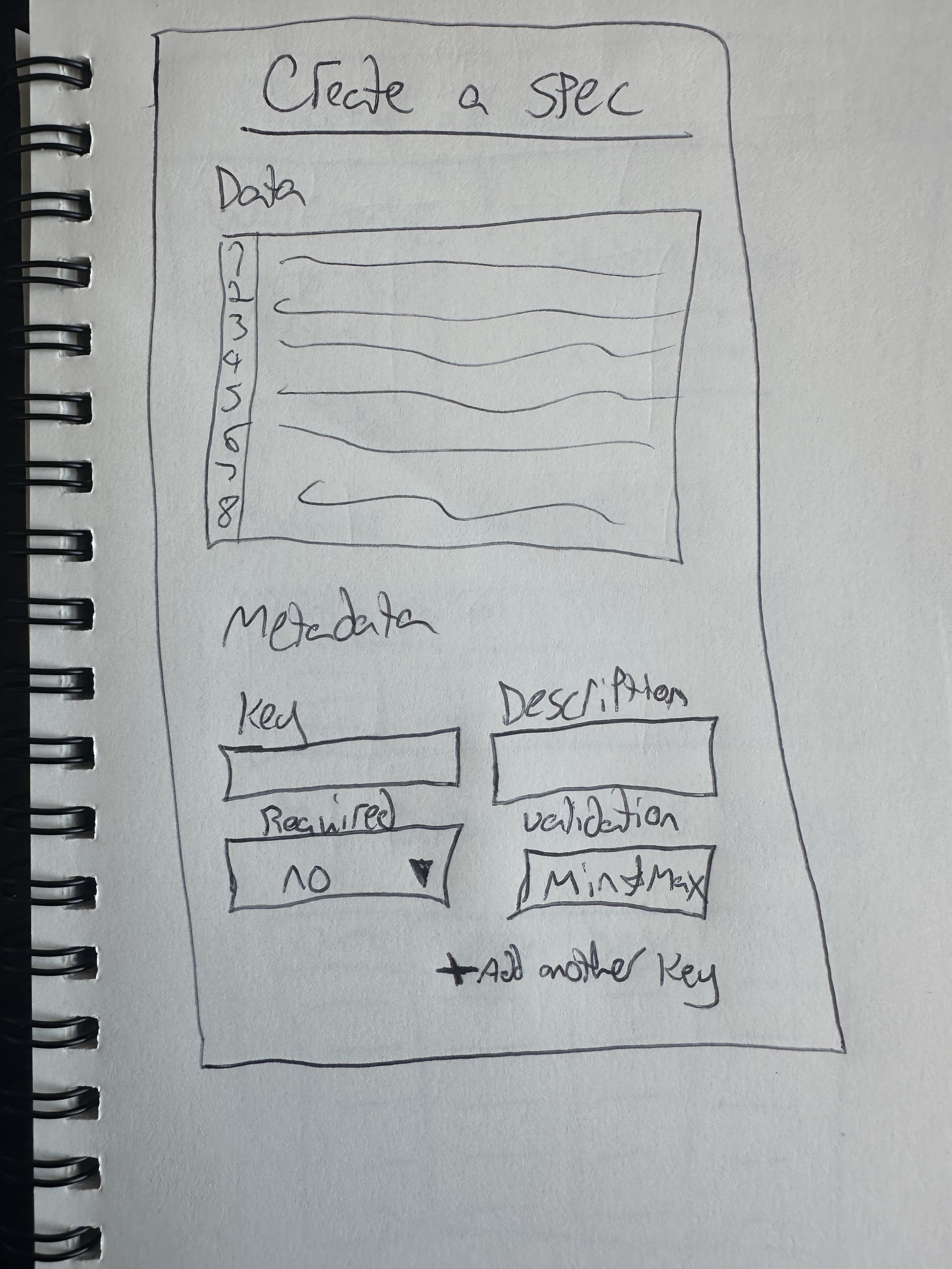
"What if we reduced the users' cognitive load when they are defining the spec by separating out the details, data, and metadata sections into different top level tabs on the same page?"
An engineer, reviewing the high-fidelity mocks
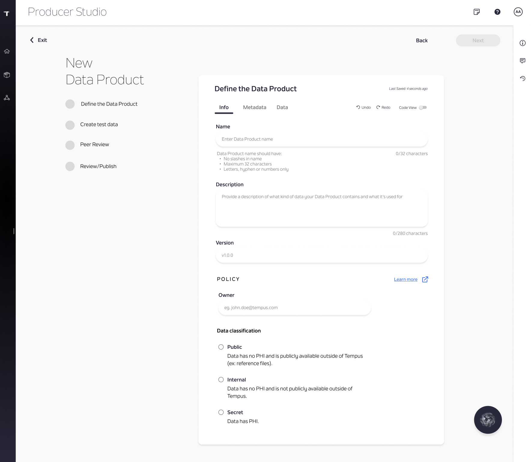
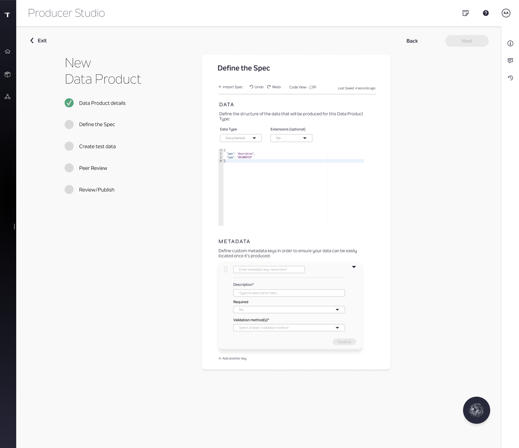
That conversation is what settled the flow into four named steps:
- Define the Data Product
- Create Test Data
- Review
- Publish
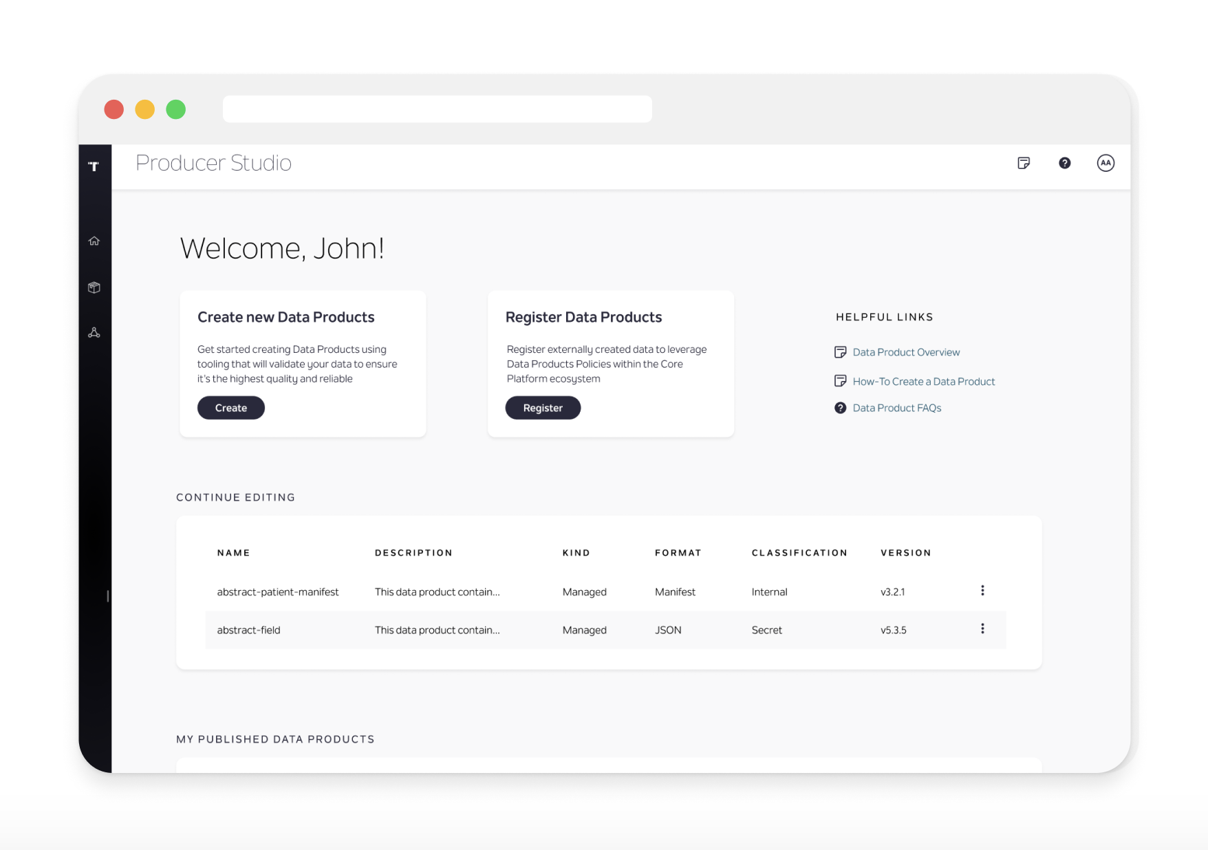
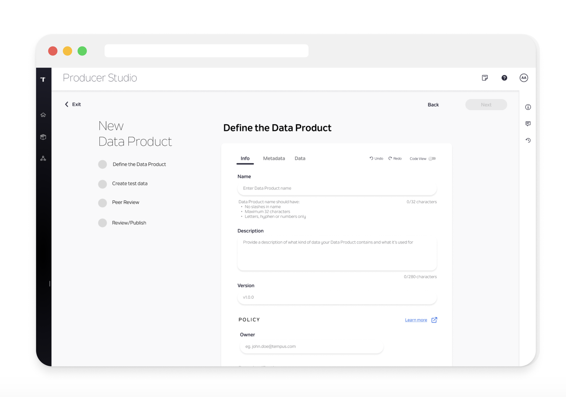
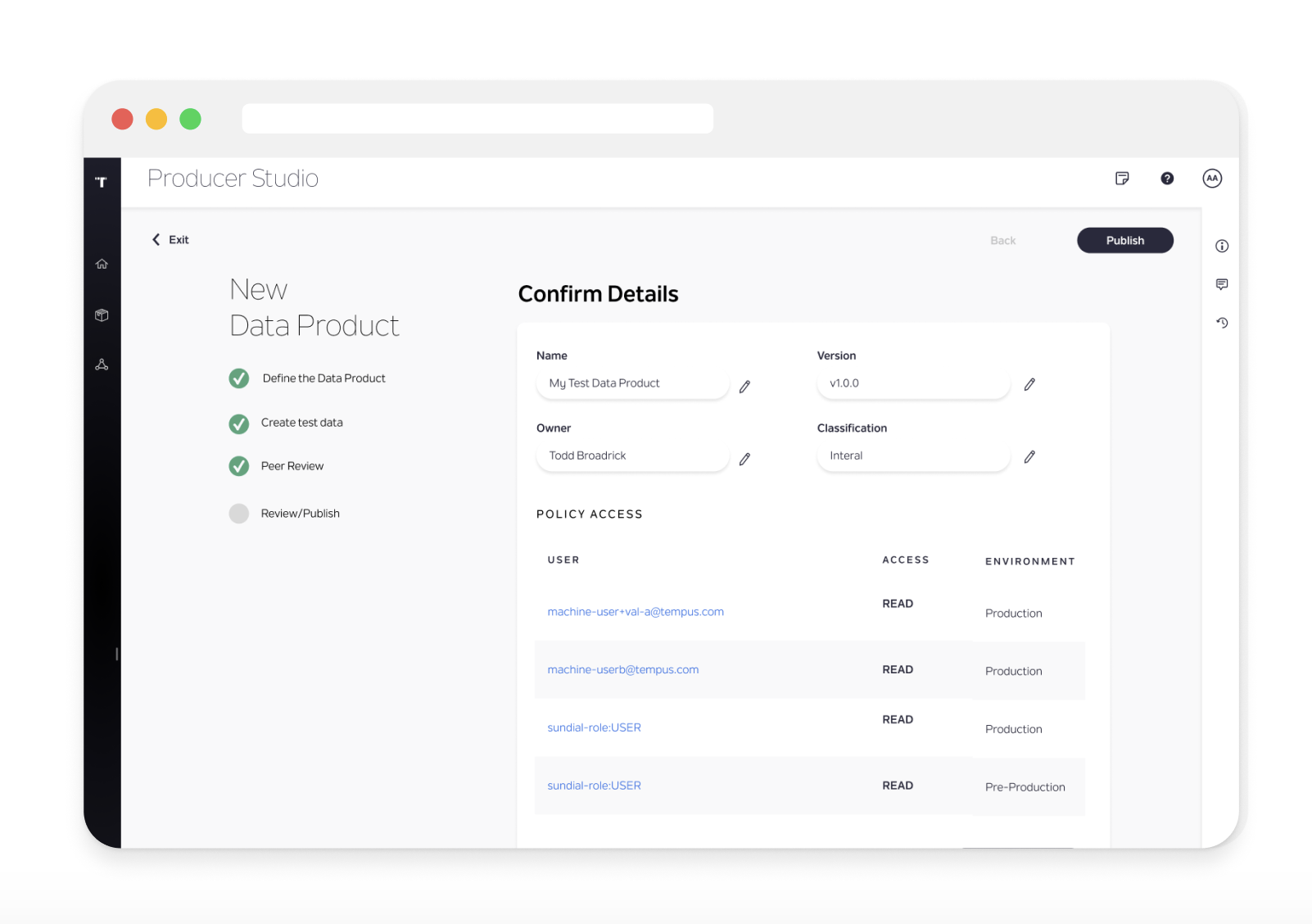
Collapse twelve screens into four guided steps
The screens below are that four-step flow, live in the Studio — each phase now a labeled, guided step instead of an unlabeled form buried among twelve others.
04 — Prototype
A quick proof of concept
With the pages and layout settled, I put together a clickable proof of concept to show how intuitive the new four-step flow could be.
05 — Reflection
Where it stands
The design held up; the resourcing didn't
This work ended up de-prioritized due to a lack of engineering resources to build it out — not for lack of validation. The project is left in a good state to pick back up when prioritization allows.
A dedicated studio is worth building
A Producer Studio for data producers is crucial in order to create a targeted user experience and reduce feature clutter.
Next steps
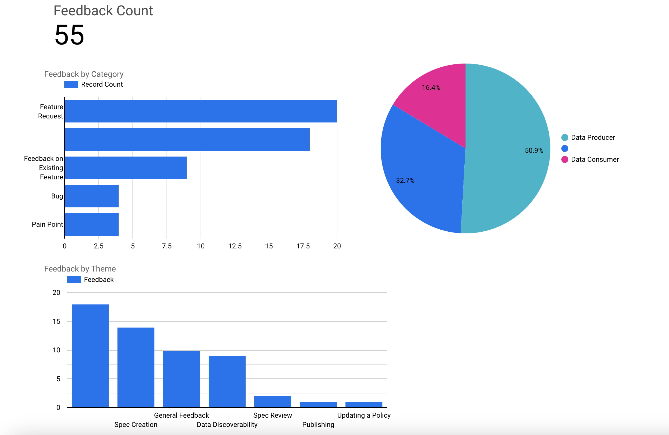
To help get this project funded, one of my next steps is organizing data around how many users would actually benefit from a more streamlined Data Product creation process. Below is a snapshot of a Looker dashboard I've been iterating on to better categorize and visualize that user feedback.