Summary
Remembering medication shouldn't take extra work
MediMate is a mobile app concept designed to help people remember when and how often to take their medications — built for a busy professional managing his own prescriptions and for a caregiver keeping track of her mother's.

Many people struggle to stick to a medication schedule simply because it's easy to forget — and forgetting leads to missed doses and worse health outcomes. The goal was an intuitive, user-friendly platform that helps people remember what to take and when, encourages adherence through motivation rather than guilt, and fits into a daily routine instead of fighting it.
I worked the problem front to back through the design thinking process — empathize, define, ideate, prototype, and test — detailed below.
Why it matters




01 — Process
Empathize, define, ideate, prototype, test
I followed the design thinking process front to back, moving from open-ended interviews all the way to a working, animated prototype — looping back to earlier stages whenever testing turned up something new.
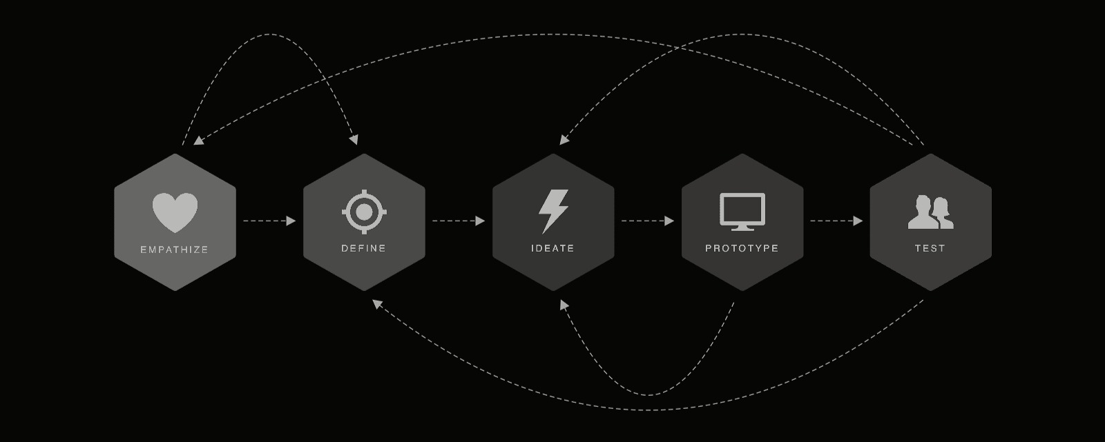
01 · Empathize & define
I interviewed users to understand their struggles with medication adherence, then turned that into user stories, journey maps, and personas — the foundation for a solution built around how these two people actually behave, not how I assumed they would.
Two personas came out of it: a young working professional who loses track of his medications amid a busy schedule, and a family caregiver making sure her mother takes hers on time. Each leads with a verbatim quote from the interview.
Age 25 · Molecular Biologist · Philadelphia, PA
"I've tried everything in the book for trying to remember to take my meds on time and nothing works."
Goals
- Take his meds regularly and on time so he doesn't go through withdrawals
Frustrations
- His biggest frustration is when the meds are working — that's exactly what makes them harder to remember to take
Behaviors & context
- Has always had trouble remembering to take medicine, let alone on time
- Used to only take medication for the occasional antibiotic; now takes daily anxiety medication and vitamins as well
Age 58 · Family Caregiver · DeWitt, Iowa
"I just wish ma would read the instructions that I write down for her, but she can never remember — or just chooses not to remember."
Goals
- Have peace of mind that her mom has taken all of her meds on time
Frustrations
- Gets frustrated that her mom needs someone to verbally tell her how, when, and how much medicine to take
Behaviors & context
- Caregiver for her mother, Michelle
- Already divides her mother's medications into a weekly organizer — timing still slips anyway
User stories
"As a busy worker, I want to be reminded automatically and regularly when to take my medications so that I don't have withdrawals."
Nick's user story
"As a caregiver for my mom, I want to have peace of mind that she is taking all of her meds on time so that I don't always need to be by her side 24/7."
Julie's user story
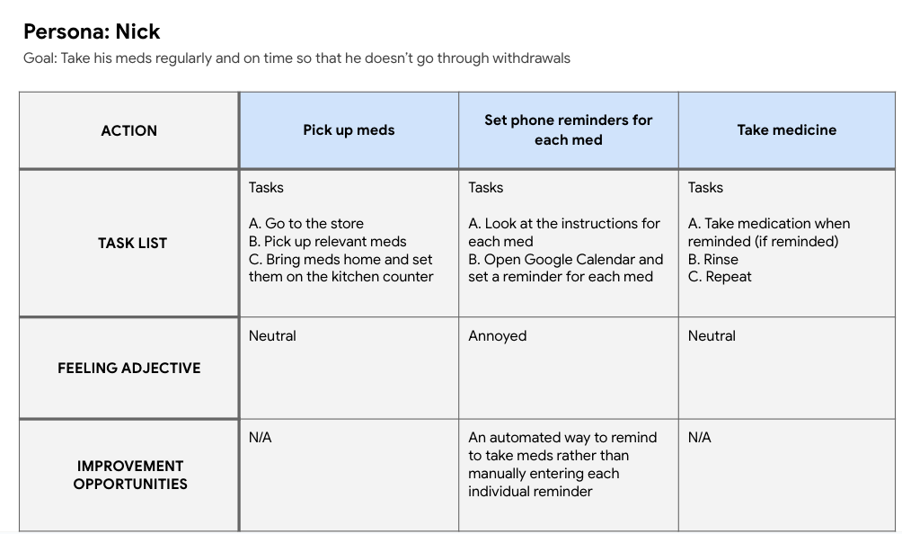
02 · Ideate
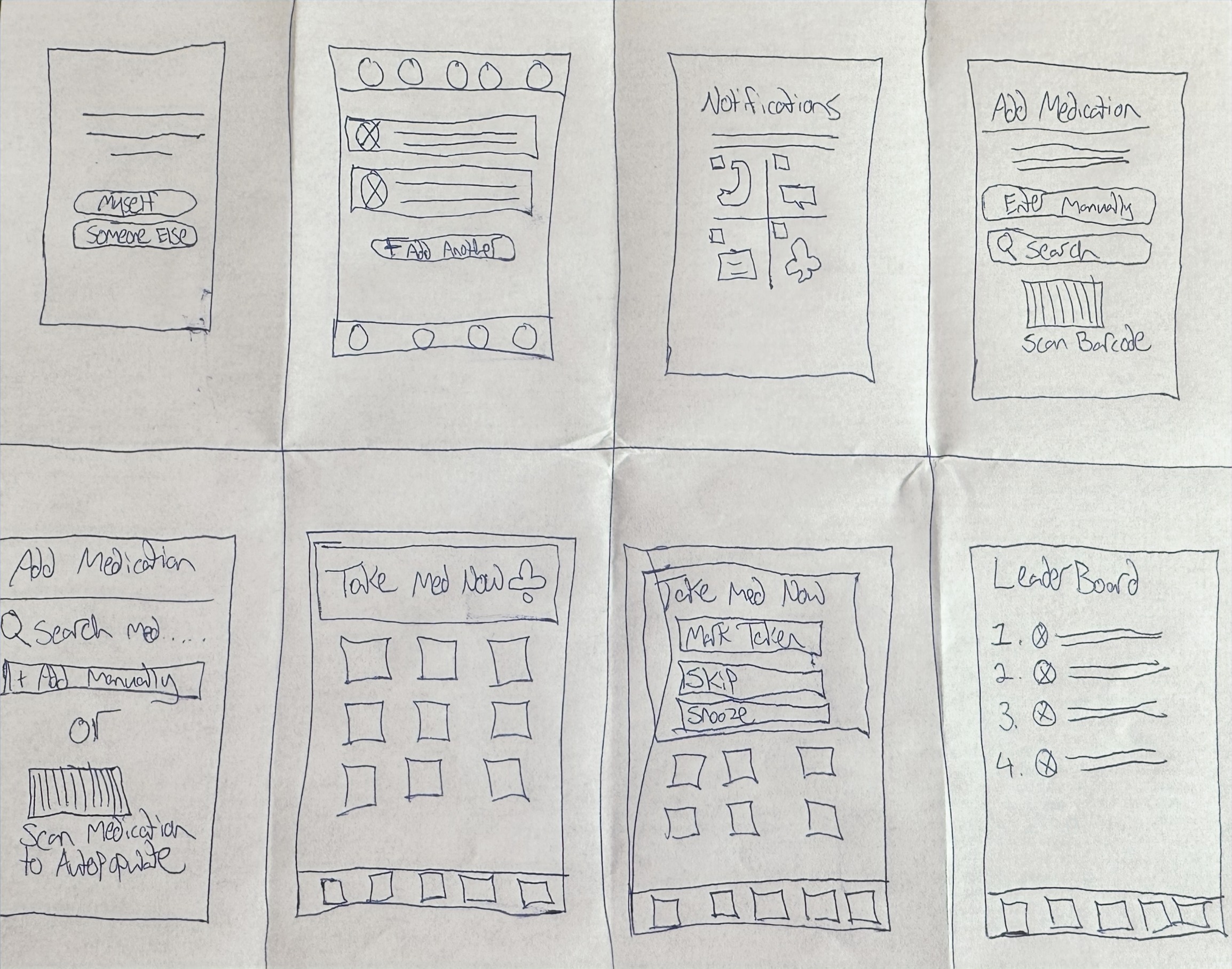
To kick off ideation I did rapid sketching — 8 hand-drawn concepts in 8 minutes, freeform, capturing as wide a range of ideas as possible before judging any of them.
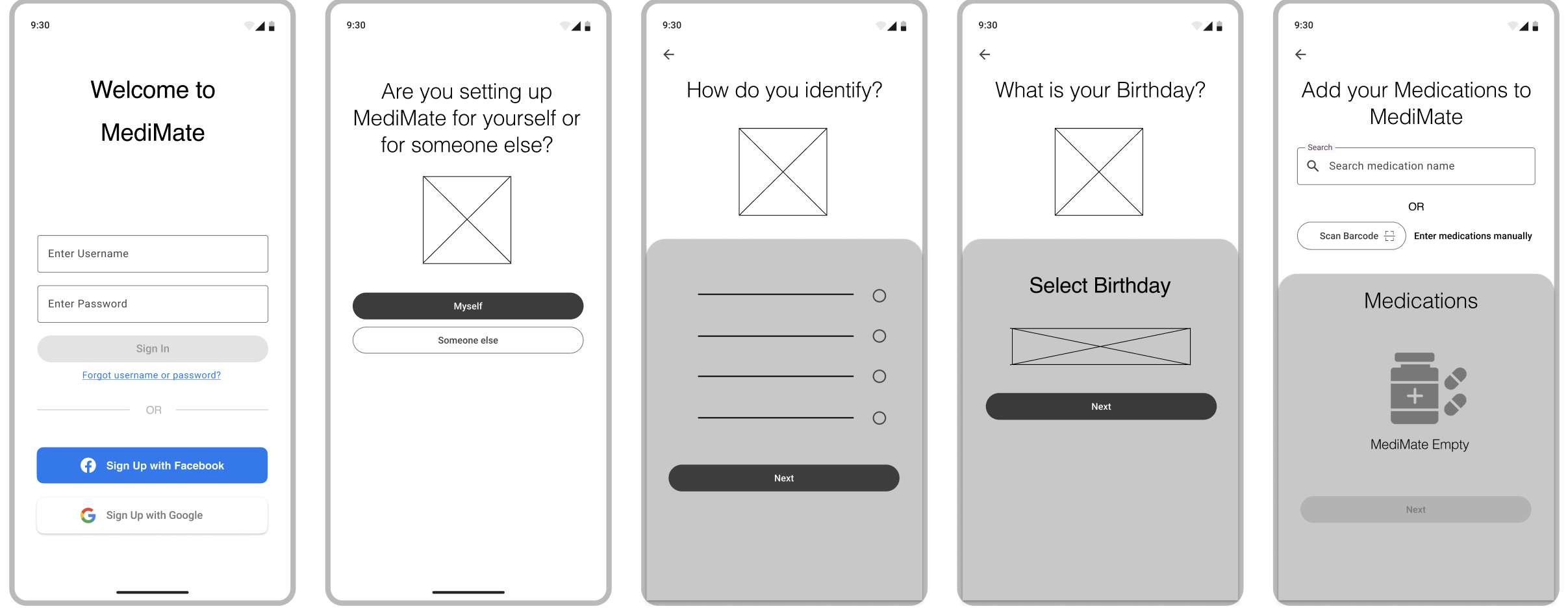
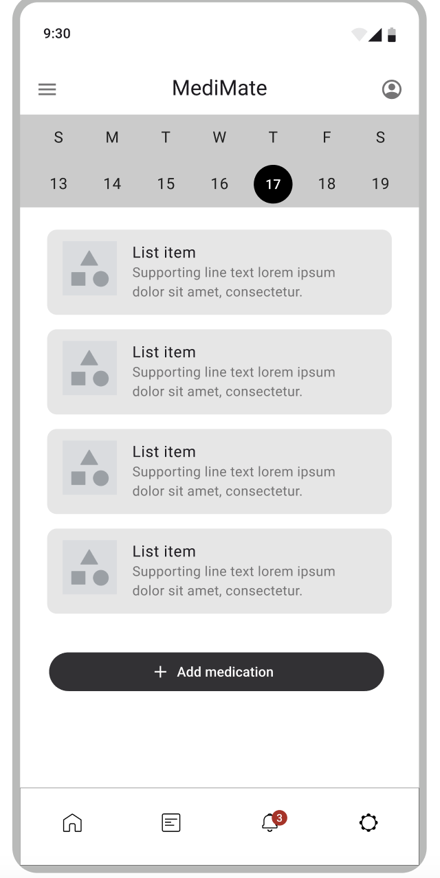
From there I moved selected concepts into Figma as low-fidelity wireframes to visualize and iterate before investing in higher fidelity.
03 · Test
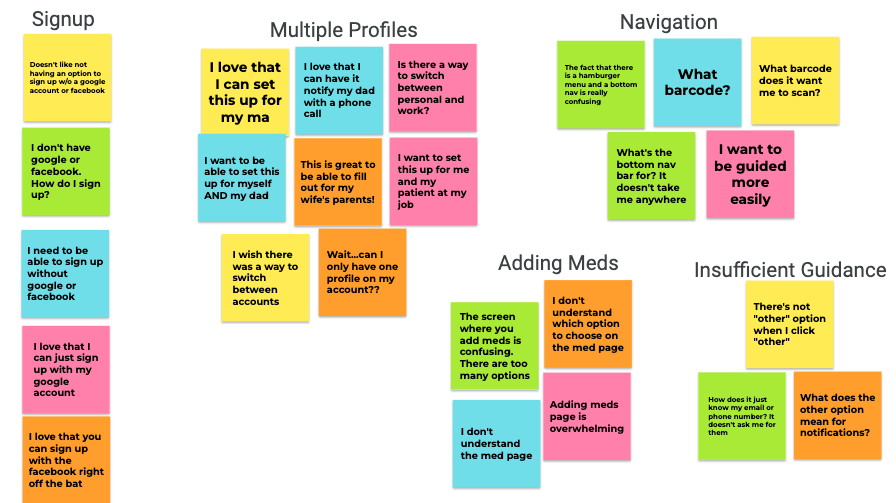
I ran user studies on the low-fidelity mockups to get early signal on what was working and what wasn't, before investing further. Feedback went into an affinity diagram, clustering related comments to find patterns and prioritize what to fix next.
02 — What testing surfaced
Five clusters of feedback, two changes that mattered most
Back in Figma, I refined the designs to answer what the affinity diagram surfaced. Two of the five clusters changed the design outright.
- Switching between accounts is needed for users who are also caregivers
- Simplify the page that instructs users on how to add their medications
- Consolidate the two navigation menus into one, at the bottom of the app
- Offer a sign-up method that isn't linked to a social media account
- Add more copy to pages that guide users toward what they should be doing
Let one account cover two people
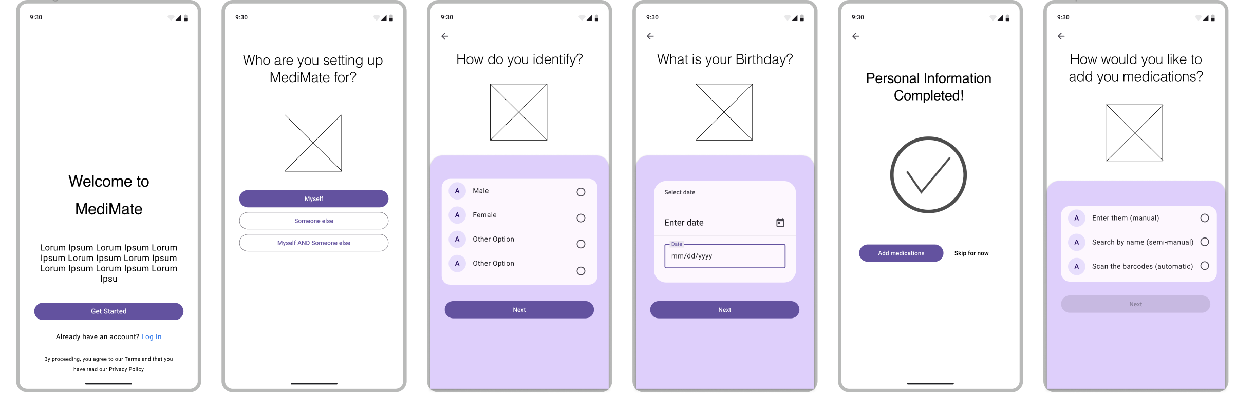
Testers who were also caregivers had nowhere to manage medications for someone else without leaving their own account. The fix was a third option at setup, alongside the existing two.
Before
Set up MediMate for "Myself" or "Someone else" — one profile per account, no way to do both.
After
A third option, "Myself AND Someone else," lets a caregiver manage her own medications and her mother's from one account.
One navigation menu, not two
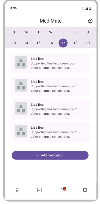
The lo-fi home screen carried a hamburger menu at the top and a bottom navigation bar — testers weren't sure what lived where, or which one to reach for.
Before
A hamburger menu at the top, plus a separate bottom navigation bar — two menus to learn.
After
The hamburger menu is gone. Every destination lives in one bottom navigation bar.
03 — Final design
From flow to working prototype
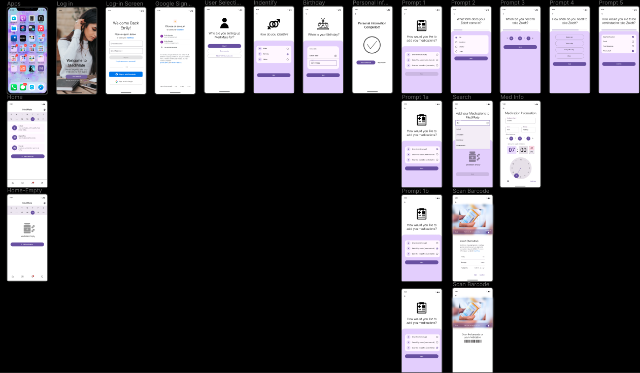
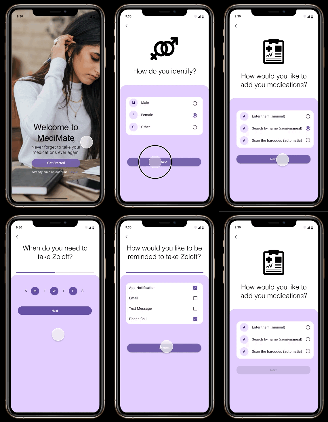
The prototype went through several rounds, refining and optimizing with each pass. Animations and interactions were layered in to show how someone would actually move through the app, and Figma's prototype testing let me run usability tests and gather feedback directly from potential users.
04 — Reflection
Key takeaways

User-centric design
Prioritize user needs and preferences, especially for elderly individuals or those with health conditions.
Simple and intuitive UI
Create a user-friendly interface for easy setup and navigation.
Personalization
Allow customization of reminders based on individual medication schedules.
Multiple reminder types
Offer various reminder options like notifications, alarms, and in-app alerts.