Summary
Emergency help for students, slowed by its own software
Small Moves gives principals emergency grants for students in crisis — a rent shortfall, a utility shutoff, a winter coat. The program works. The software around it was quietly working against it: principals needed a support call just to get started, approved requests sat for weeks, and the staff didn't trust their own numbers.
I redesigned both sides in three weeks — research through engineering handoff — then stayed on through the build.
01 — The problem
Three failures, one of them structural
Small Moves had doubled in size and outgrown a portal built for a smaller version of itself. They handed me a list of complaints; my job was to find which were symptoms and which one was the disease. Screens below are the portal as it stood, annotated where it hurt.
Principals couldn't start on their own
Every new principal booked time with the ops lead just to create an account. The causes were mundane — and nowhere more than at the last step of setup, where a screen that means "you're done" gives no sign of it.
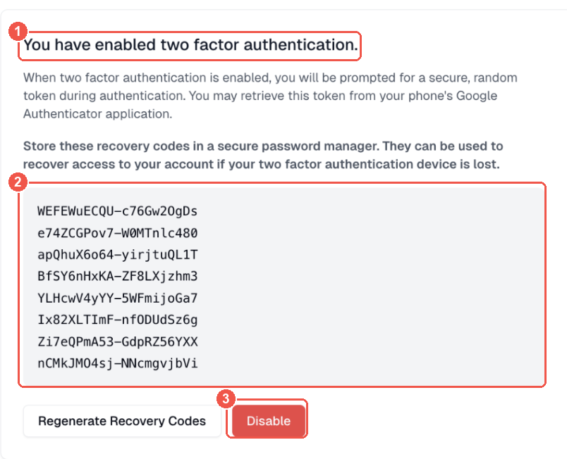
- The heading states a fact rather than confirming success — no tick, no "you're all set," and no button to continue. The flow just stops.
- Eight recovery codes with no copy action. Nobody saved them, so staff reset them by hand every time.
- The only coloured control on a finished screen is a red Disable. The one thing that looks like the primary action undoes the step you just completed.
Nobody knew whose turn it was
After approval the request went back to the principal — but that step hid behind a
⋯ menu. Principals thought they were waiting on Small Moves; Small Moves
thought they were waiting on the principal. Requests sat for weeks with a family on the
other end of them.
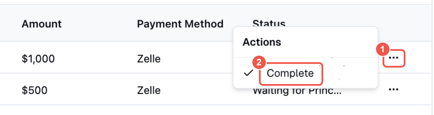
- The only way in is a
⋯overflow at the end of the row. - Behind it, a single item: Complete. That is the step that moves an approved request forward — and the whole reason requests stalled for weeks.
The admin side had the wrong primary object
Reviewing one request meant copying a name and checking two tabs for prior giving, with payment in a third. Underneath that: funding and history hung off the principal record, not the school — which holds right up until a principal leaves. In K-12, that's constantly.
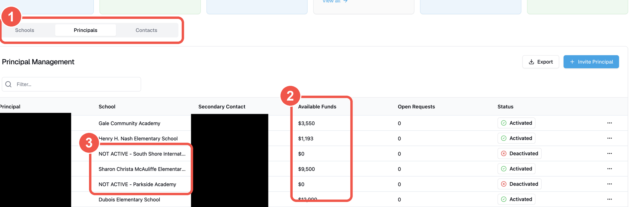
- Schools, Principals and Contacts are three peer tabs — so reviewing one school means visiting all three. Principals is the active one, under a Principal Management header.
- Available funds sit on the principal row. The budget belongs to whoever currently holds the job, not to the school.
- Departed principals never leave. They stay as "NOT ACTIVE" rows and pull straight into funder reports.
"Why has my request been sitting for a week?"
The question that kicked off the engagement
02 — How I worked
Five phases, four rounds of validation
The foundation had been burned by a previous dev team that built on assumptions. One rule for the engagement: nothing goes into a flow I can't point at a source for.
01 · Listen, then triangulate
One hour with ops, finance, and the program lead — recorded, so I could listen instead of transcribe. Then I checked my synthesis against the issues list they'd already written. Agreement meant a confirmed problem; divergence meant a question worth asking — usually a symptom on paper with the cause still in the room.
02 · Model both users
The Principal is infrequent and low-fluency, working in short bursts, and needs to know which step is theirs. The Admin lives in the tool — not confused, just worn down by manual relays and numbers they re-check by hand. One needed clarity; the other consolidation.
Primary school contact · infrequent user · low portal fluency
"Why has my request been sitting for a week?"
Goals
- Get a family help quickly, without barriers
- Know exactly which step is mine, and when
- Stay anonymous to the beneficiary
Frustrations
- After approval, doesn't realize the request is back on them → it stalls
- Confusing 2FA + accidental password resets
- Can't resend the beneficiary link or switch email/text
- Third-party payee (minor / no bank acct) is a hidden checkbox
Behaviors & context
- Busy educator; uses the portal in short bursts
- Low tech comfort; needed a live walkthrough to start
- Often submits several requests at once
Small Moves team — ops · finance · program lead
"We don't trust it — we double-check everything ourselves."
Goals
- Move funds accurately and fast, with a clean paper trail
- Trust the numbers and report per funder
- Spend time on the mission, not coordination
Frustrations
- Manual relay to fix payment issues (finance ↔ ops ↔ principal)
- Cross-tab digging just to see a request or prior giving
- Backend edits don't reconcile → data they don't trust
- Funds tied to principals, not schools; inactive schools pollute reports
Behaviors & context
- Reviews/approves, then chases principals & beneficiaries by hand
- Reconciles monthly/annually; reports out to funders
- Doubled in size — outgrowing the current site
Then both journeys end to end, with all sixty pain points placed on the stage where each one actually happens. The principal's line dips hardest right after approval — where the invisible handoff lives. The admin's bottoms out at reporting, furthest from where the data problem starts.
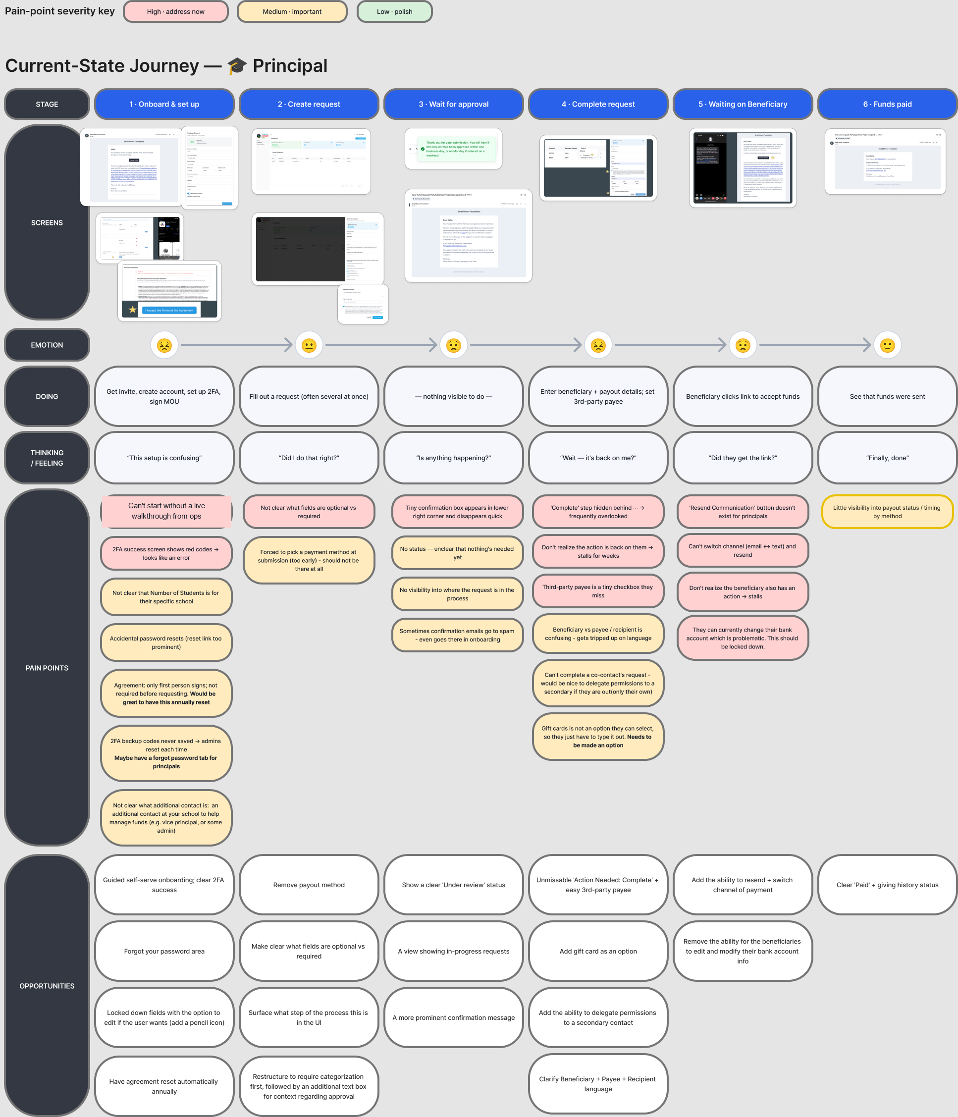
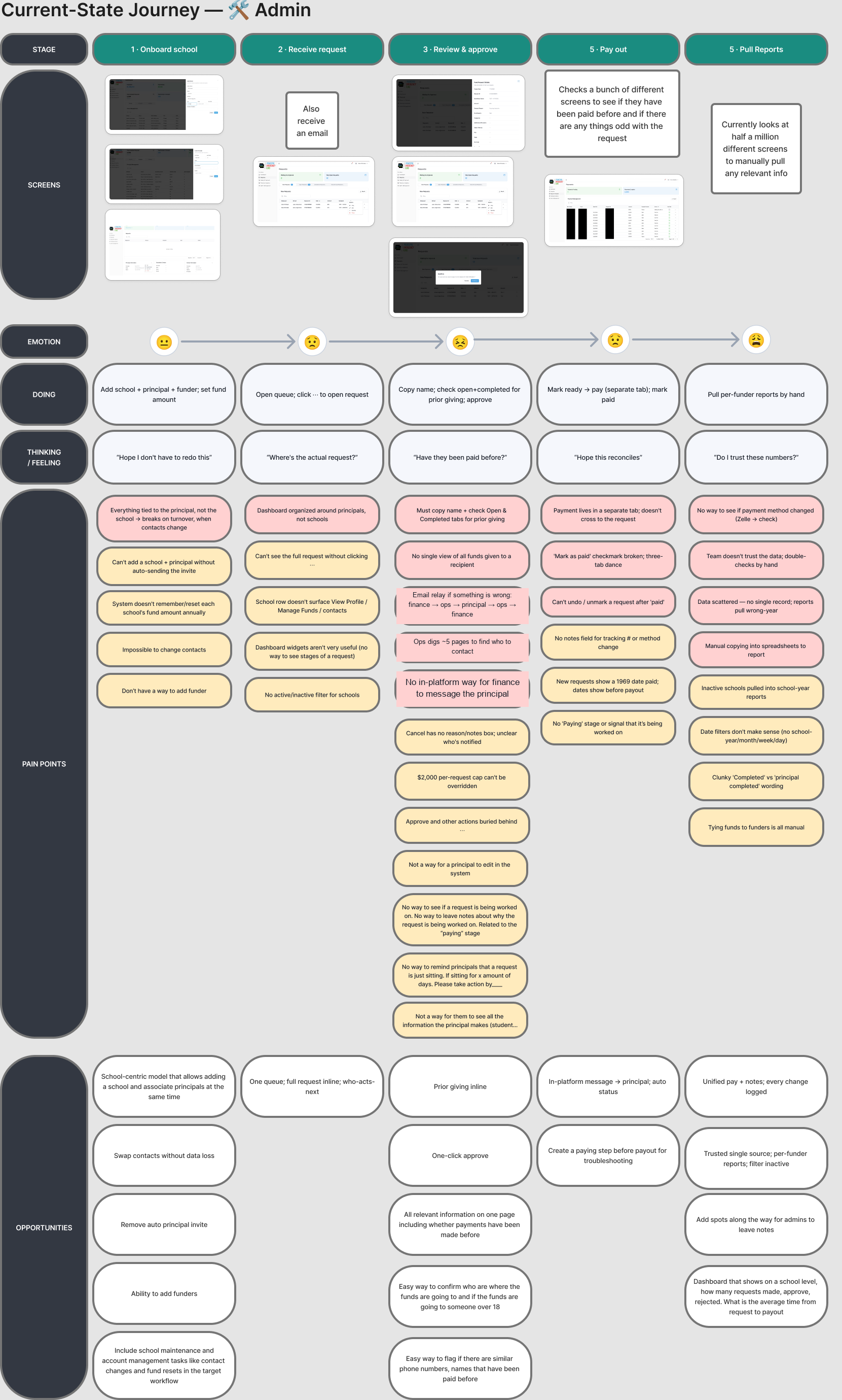
03 · Draw the target, then the screens
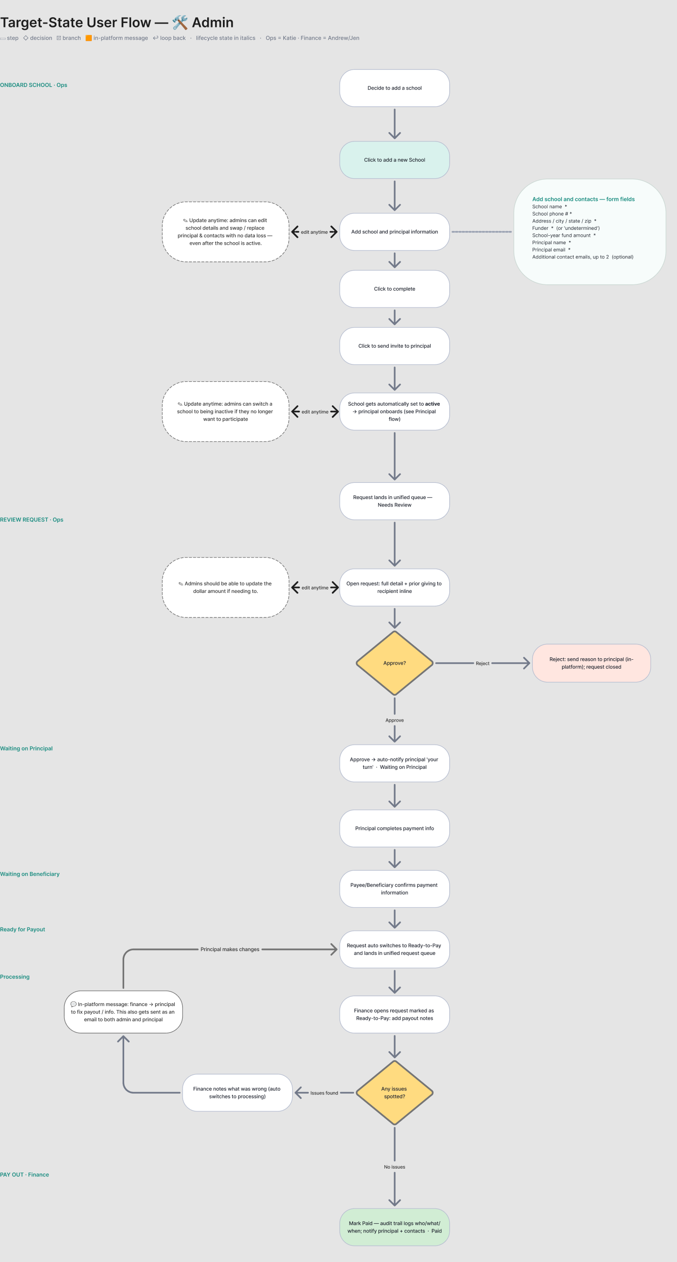
One flow per persona, with explicit markers for the steps that happen off-platform. I drew the request lifecycle as its own artifact — it became the stepper in the UI, the state machine in the handoff, and the shared vocabulary for everything after.
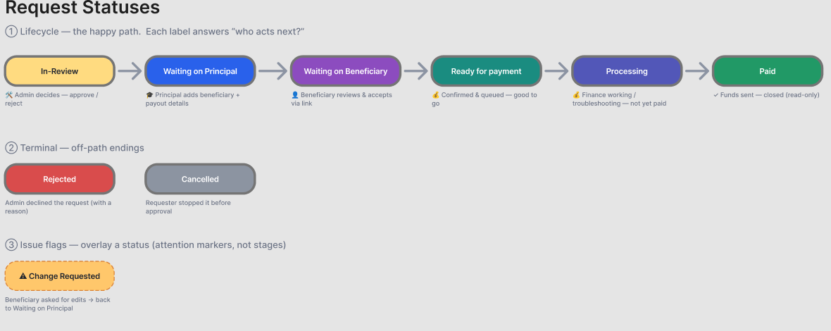
Processing was later split in two during the build — see §05.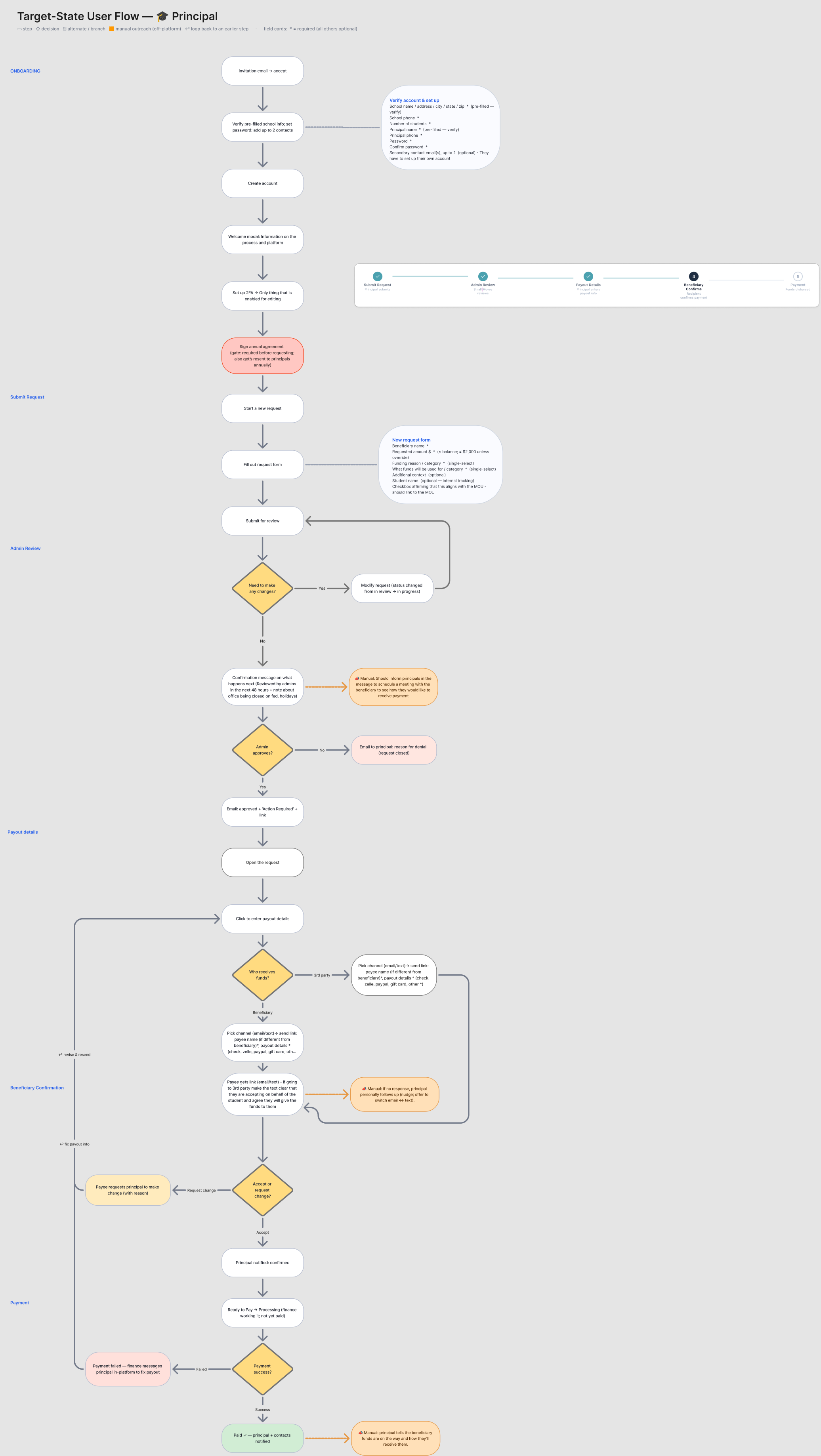
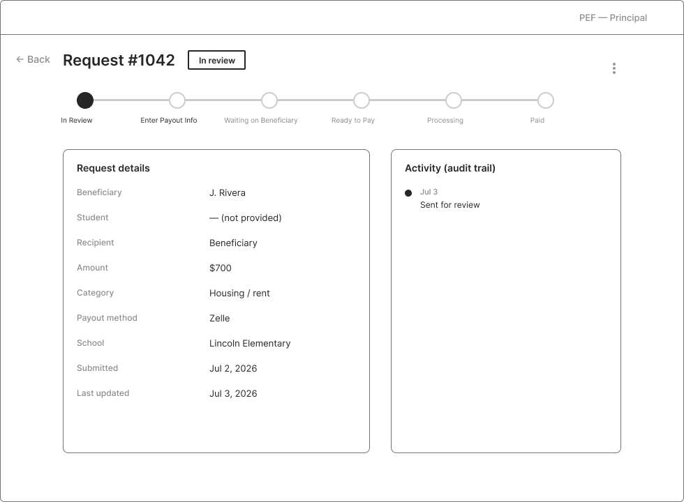
Then Claude Code generated low-fi wireframes into Figma from those flows and the live site; I edited by hand. Grayscale on purpose — settle structure before anyone reacts to colour.

04 · Prototype and validate
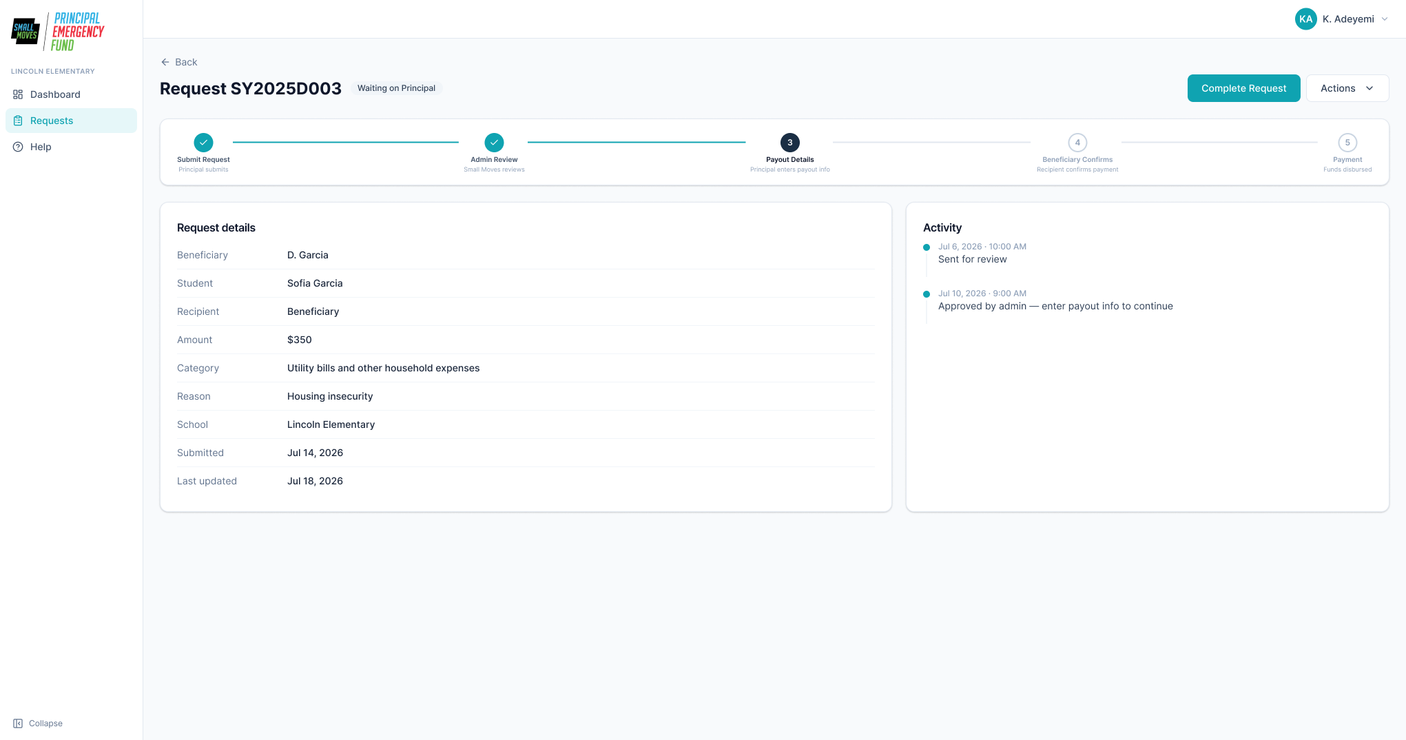
A new repo in Cursor built against the wireframes and the current site — same framework, no backend, realistic state. Principal side first, then admin behind its own login, then live sessions clicking through it with the team. This is where the design got good: a prototype surfaces what a static screen hides.
05 · Spec and hand off
Every screen and state pushed out of the prototype into fifty Figma frames — one last review with every state present rather than implied. The client's CTO was rebuilding with AI coding tools, so the handoff had to carry reasoning, not just layout:
- Sitemap — every route, its fields and actions, and what each does to state.
- Request State Flow — the status machine, transitions table, both onboarding flows, the permission matrix, the payout decision tree, ten email templates, and the budget maths.
Both flag their own gaps — a handoff that hides its soft spots just moves the discovery cost downstream.
Why three weeks was possible
Not skipped steps — every phase above happened, including four rounds of client validation. What changed is the cost of the artifacts between them: wireframes out of the flows in an afternoon, a prototype out of the wireframes, fifty frames out of the prototype. That bought time for the parts that don't compress — the listening, the triangulation, sixty pain points placed by hand, and four rounds of changing the work based on what the team said.
03 — The decisions
Four moves that did most of the work
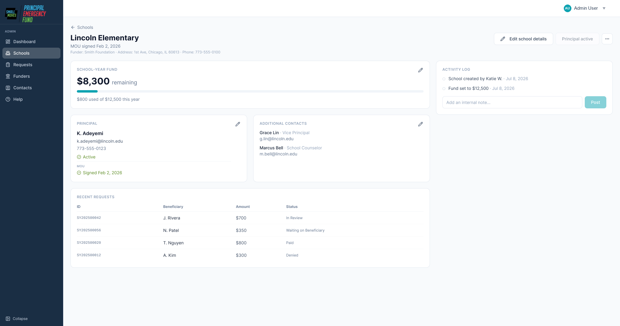
Make the school the durable object
The school becomes the permanent record and the principal a time-bound assignment against it. Requests, balances, prior giving, and the signed MOU all belong to the school; turnover becomes a contact swap.
It reads like a database decision, but it sets the primary object in the UI — and the whole admin side reorganises around it.
Before
Principal leaves → history is orphaned, reports pull wrong numbers, finance reconciles by hand.
After
School owns the record permanently. Turnover is a contact edit and a re-invite — no data loss.
Name every status for who acts next
The old statuses described the system's internal state. The new ones describe whose turn it is.
Lifecycle
Sent back to the principal
Terminal
A principal who sees Waiting on Principal doesn't need to be taught anything — the status is the instruction.
Put the walkthrough call inside the product
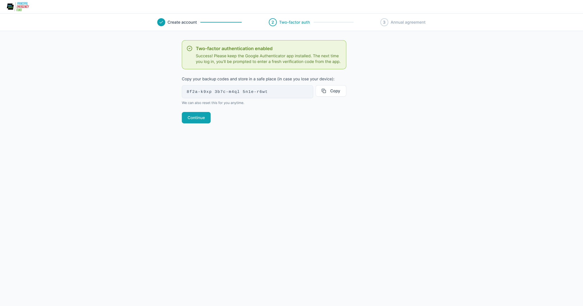
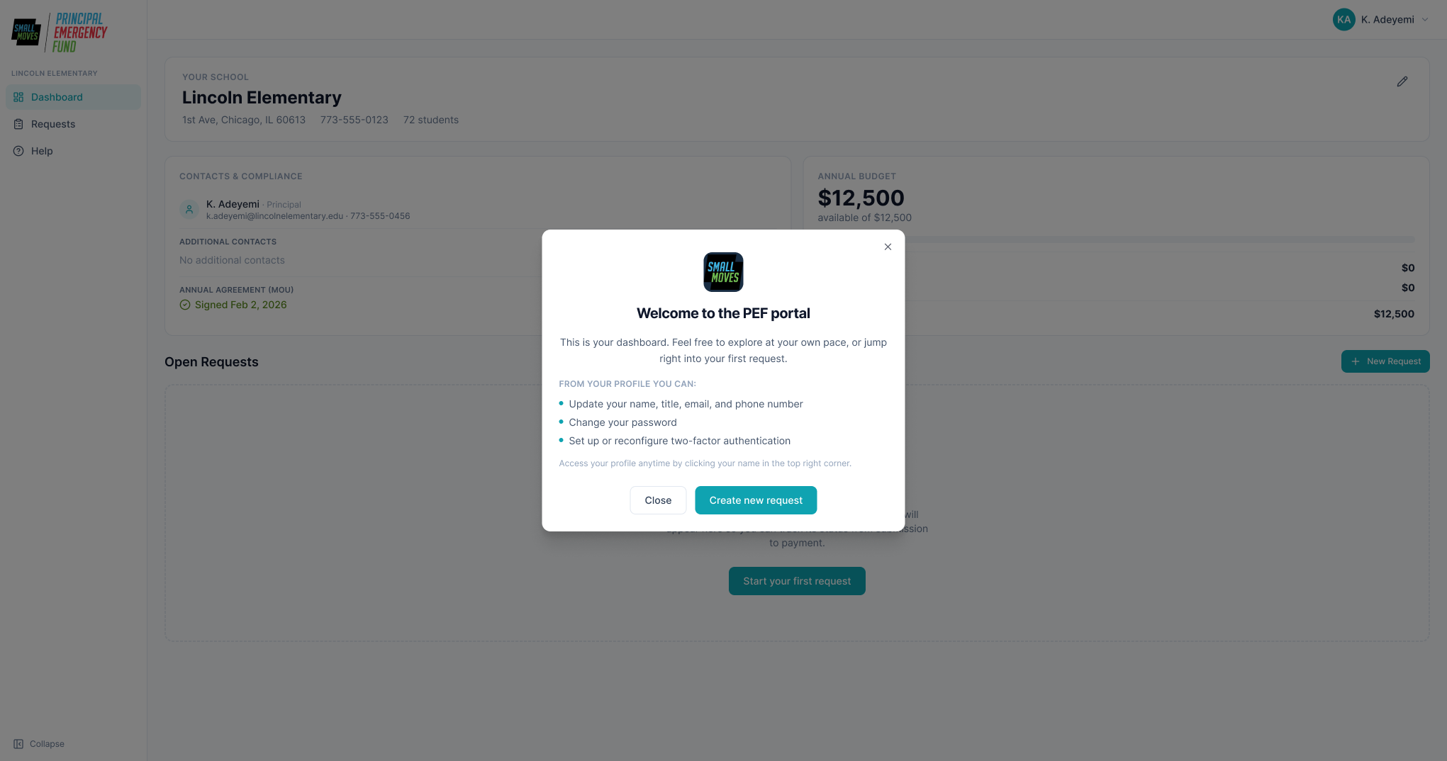
Three steps, an explicit stepper, and a fix for each thing that had been stopping people:
- 2FA success now reads as success, with a copy action on the backup codes
- Password reset demoted out of accidental-click range
- "Additional contact" explained where you enter it, not in a help doc
- A first-login welcome modal covering what the call used to
The success condition wasn't a nicer flow. It was the ops lead's calendar.
One record, one log
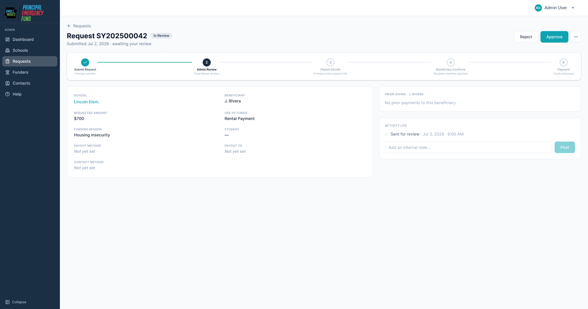
Everything a decision needs on one page: the request, payout details, prior giving to that recipient inline, and the actions valid at this status.
Ops notes, finance notes, and system events go into a single timeline — no separate payout-notes field, because a second place to write notes is a second place to not look. That log is also how finance sends a request back without denying it: ask for a change or ask a question. Both resolve in-app, replacing an email relay that used to run finance → ops → principal → ops → finance.
04 — What was built
The shipped product
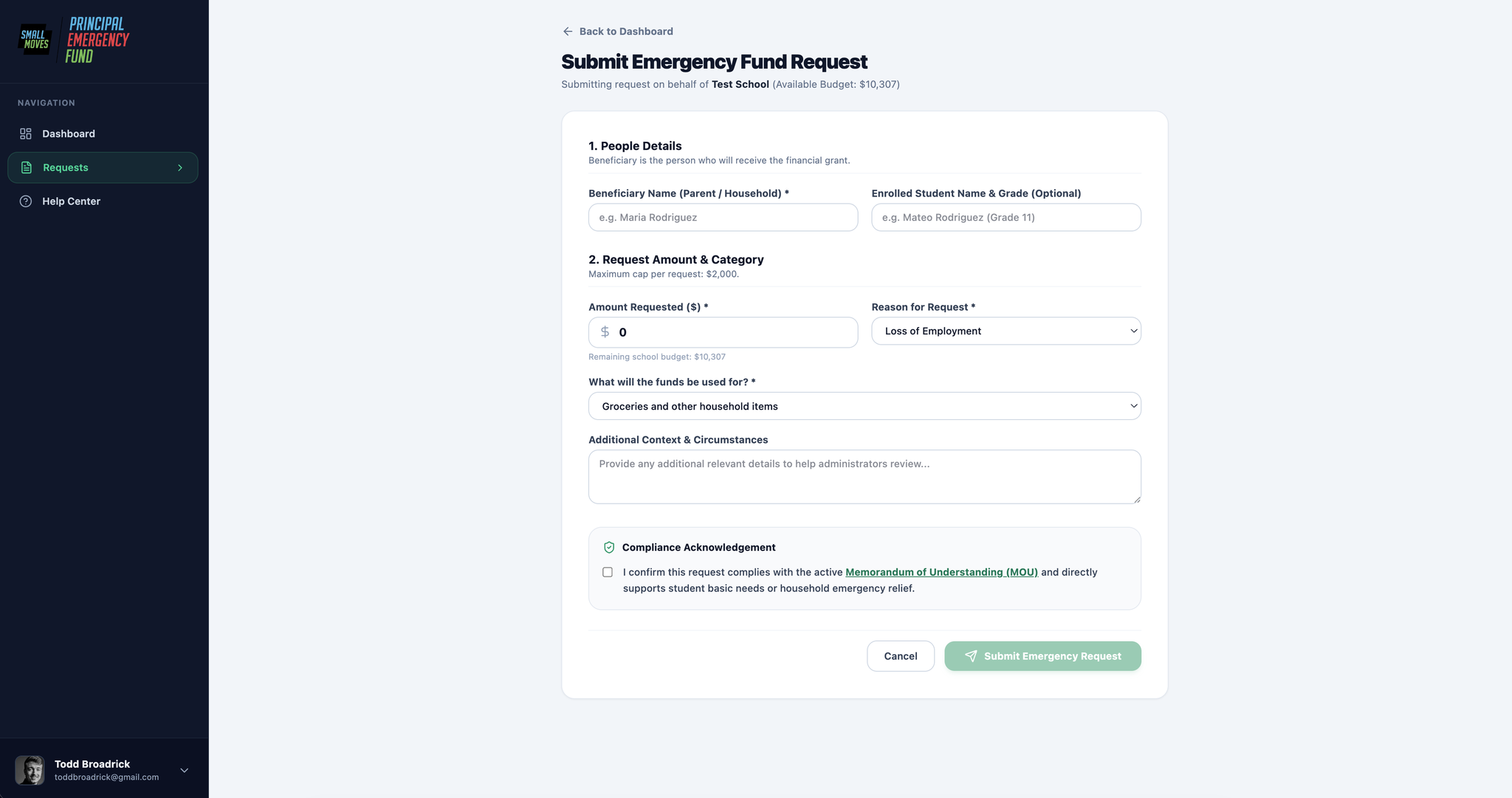
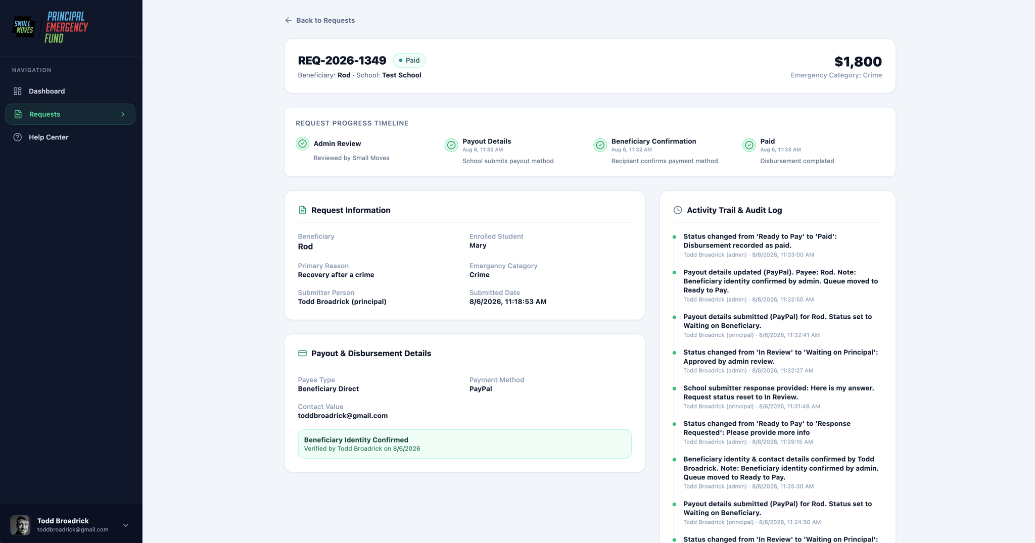
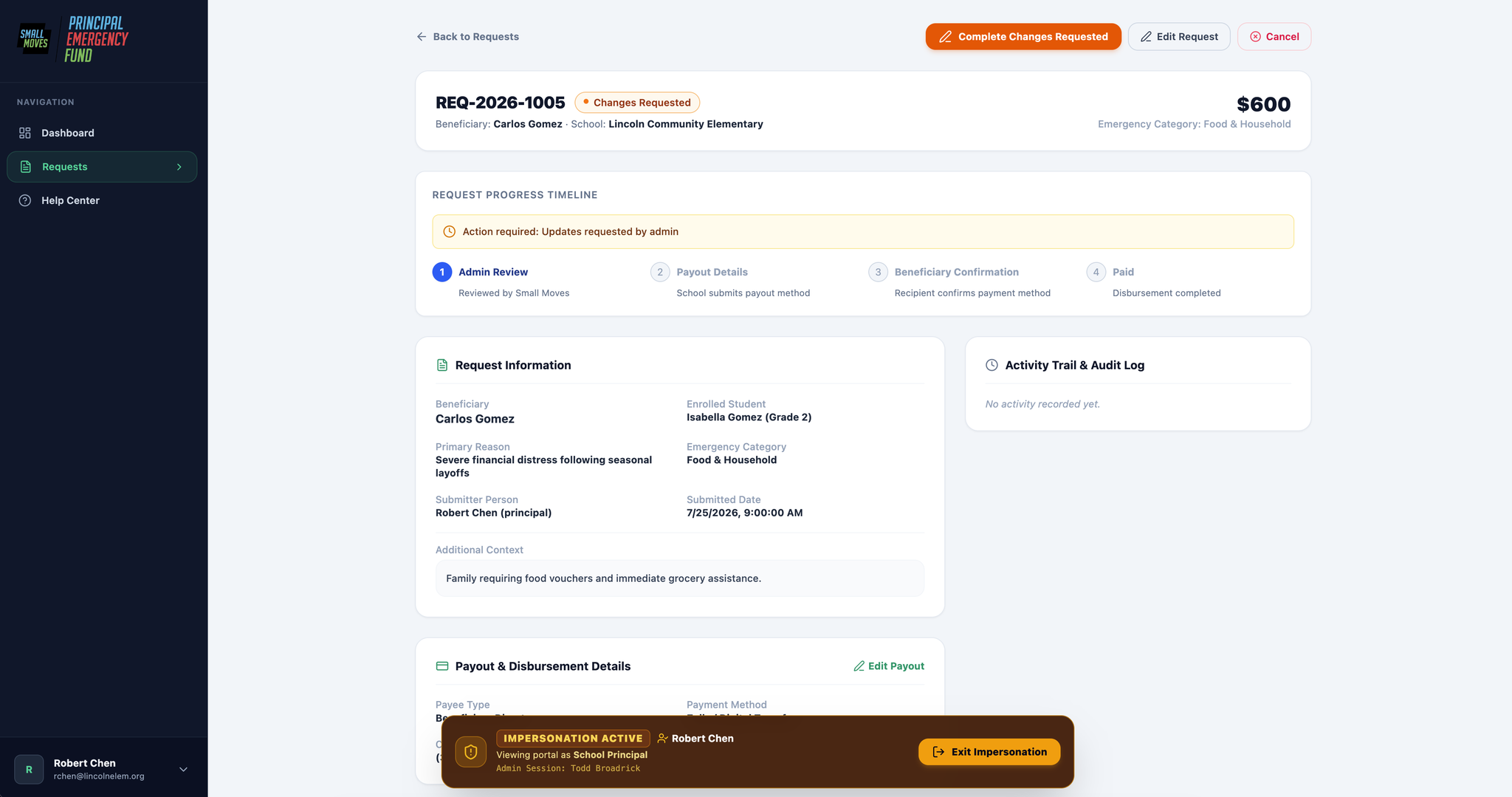
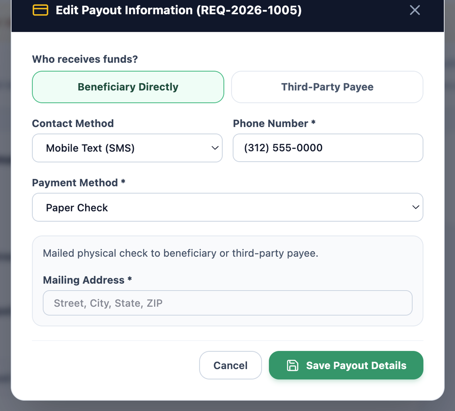
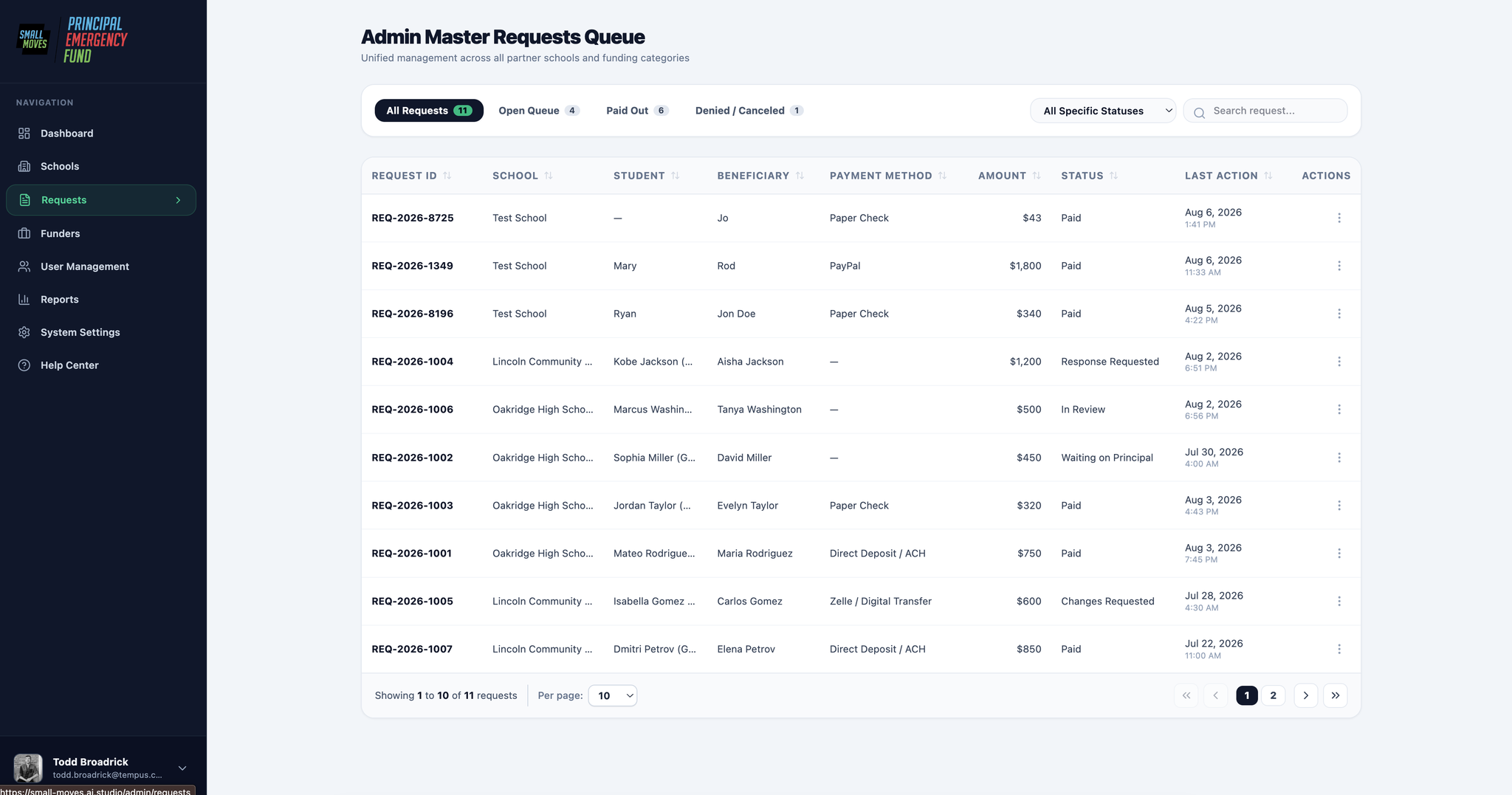
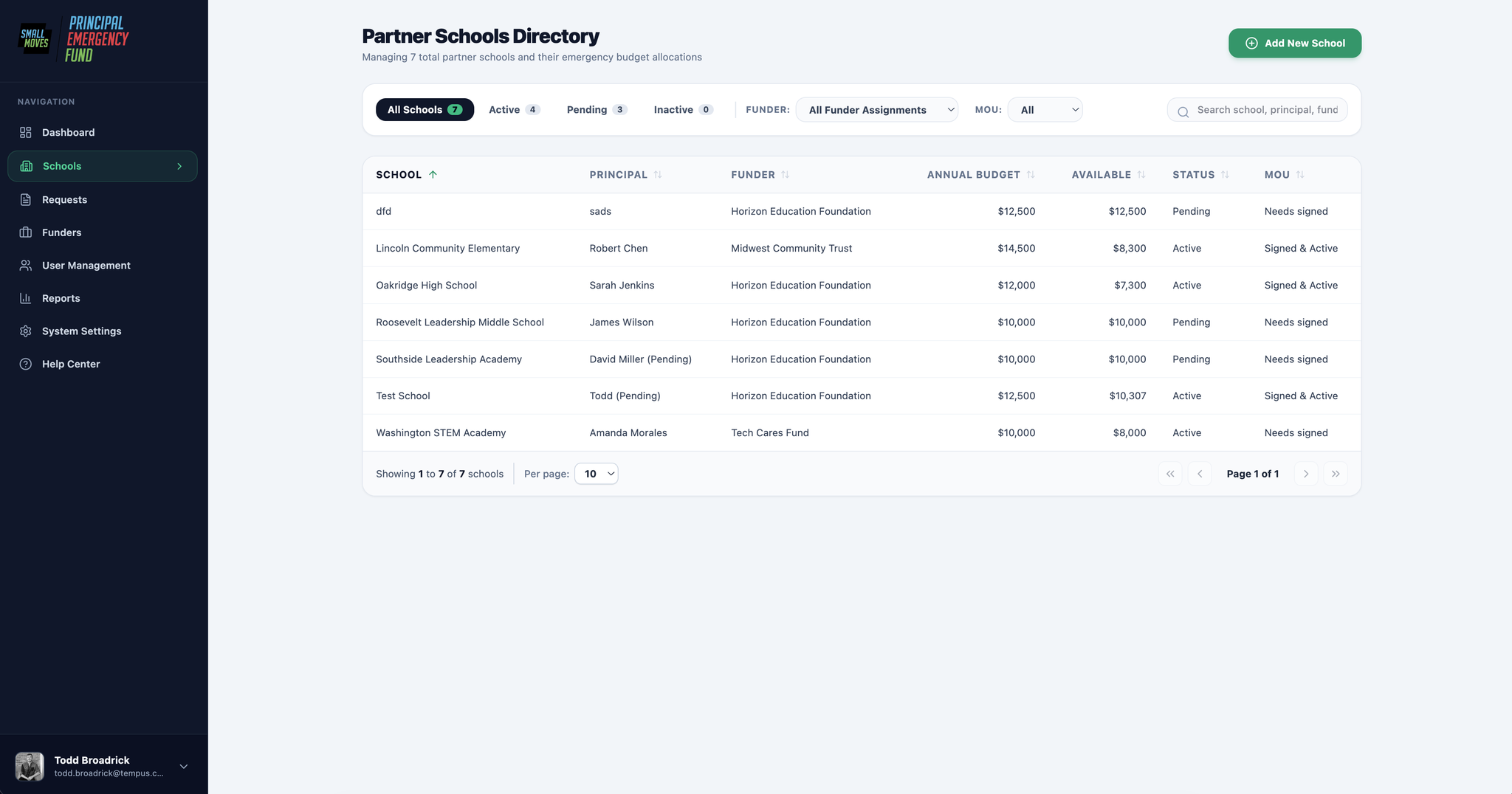
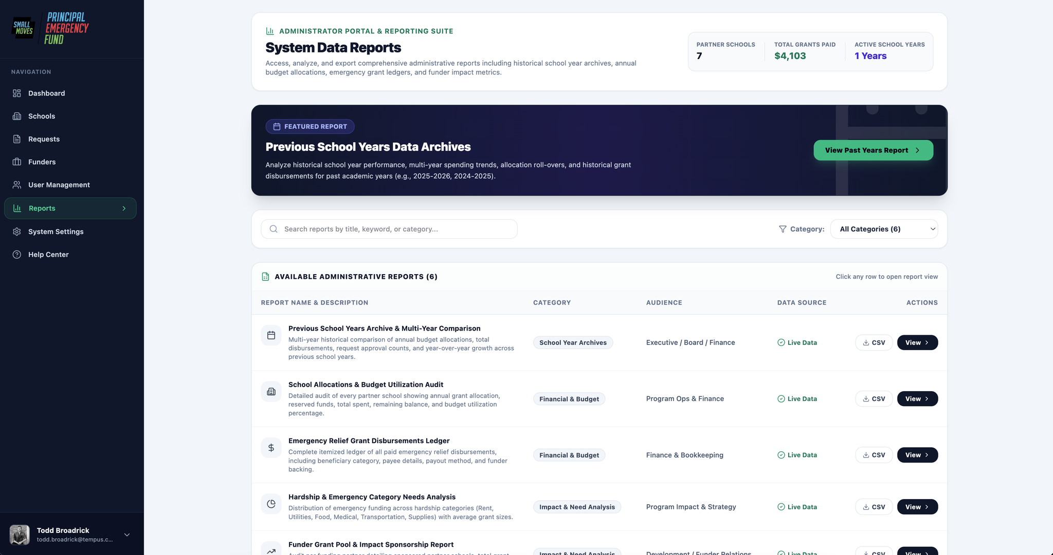
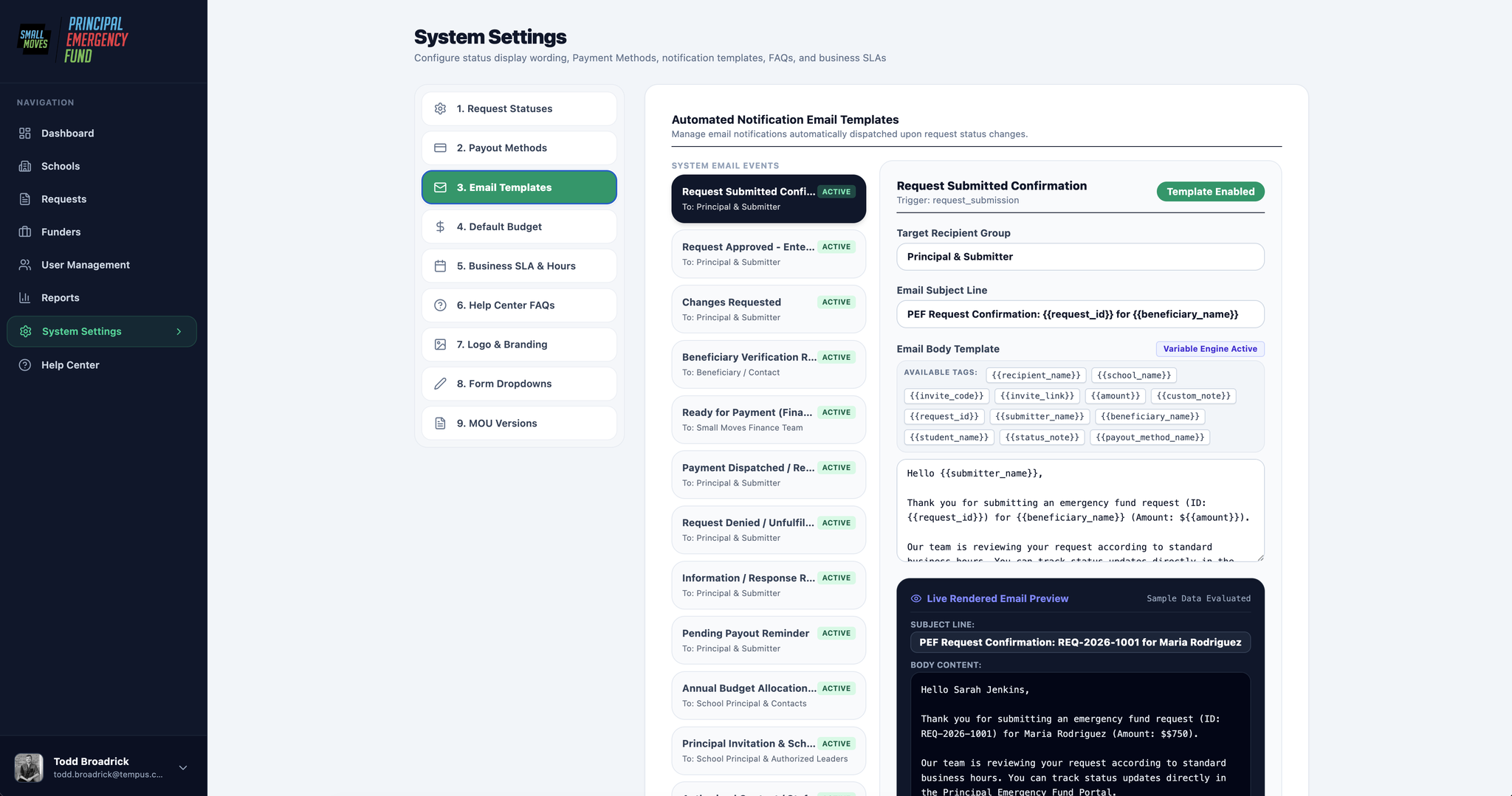
Screens from the live build, not the Figma spec. Two portals on one shell: principal scoped to a school, admin scoped across all of them.
Principal — submit, track, complete

Admin — review, pay, report
Safety hatch — admin impersonation
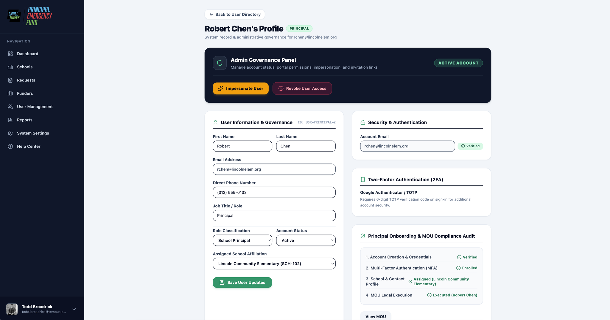
One capability we added during the build: an admin can impersonate a principal and see the portal exactly as they see it — the same dashboard, the same request, the same button they're supposedly stuck on.
It's a direct answer to the old support call. When a principal says "I don't know what to do next," the ops lead no longer has to reconstruct the problem over the phone from a description. They look at the screen.
The expectation is that it gets used less over time, not more — if the status labels and the Action Needed callouts are doing their job, there's less to be stuck on. But a support tool you rarely need is worth far more than one you can't reach when you do.

05 — What the build changed
Maintainability won a fight with pixel fidelity
The most interesting design decision on this project wasn't mine, and it happened after handoff.
The client's CTO built and deployed the portal; I stayed on as his design and product counterpart through it. He trialled two builds: Codex, engineering-focused with tighter front-end control, and Google AI Studio, far more approachable. He chose AI Studio — not because it built better, but because Small Moves has no dedicated engineer. AI Studio leaves the team able to maintain the site themselves once we're gone. For a nonprofit this size, a system nobody on staff can touch isn't a system; it's a future invoice.
It cost us. AI Studio only runs Google's own models, and there was no clean way to wire it to the Figma MCP as we'd planned — so the build never read the spec directly. The teal became green, density and type scale shifted, components got reinterpreted. With a hard launch date we made a call: prompt our way to the visual corrections that mattered, and protect UX behaviour over pixel fidelity.
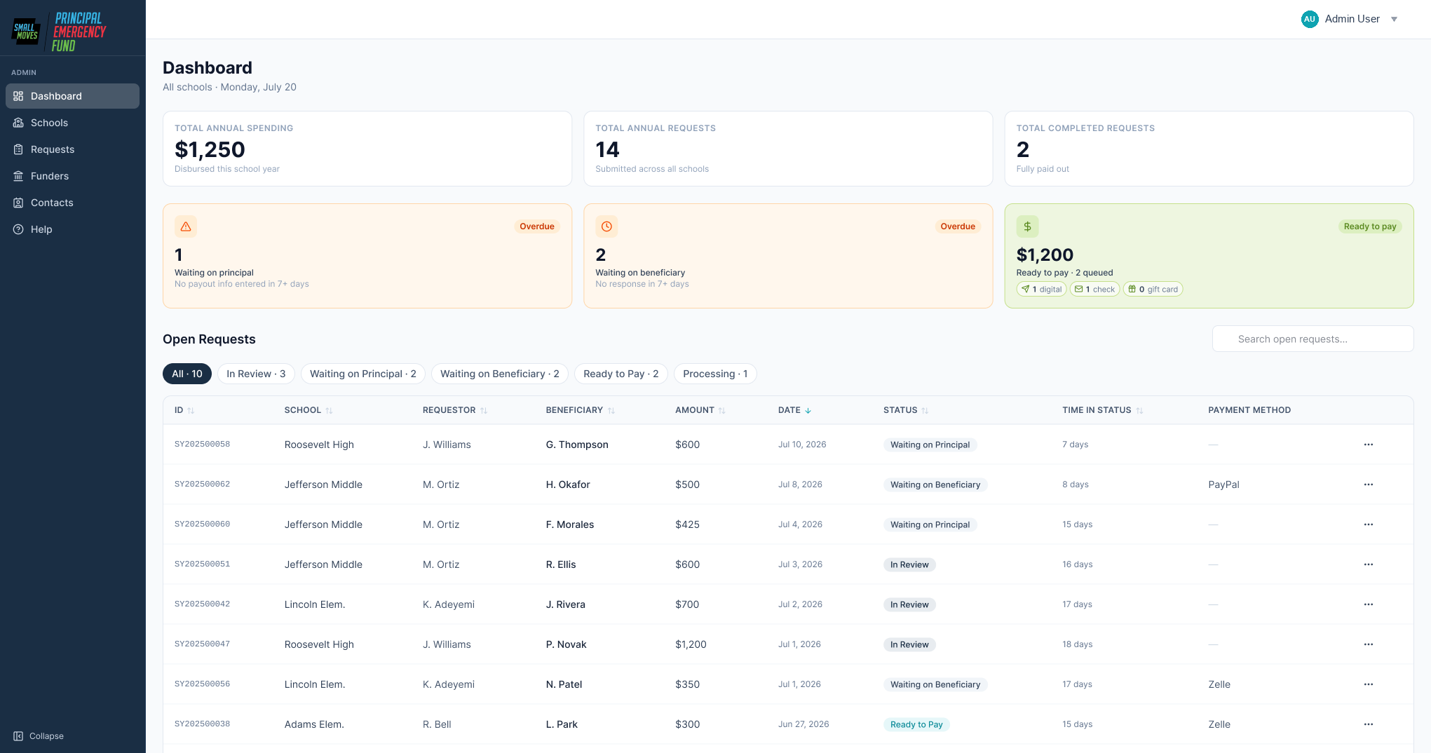
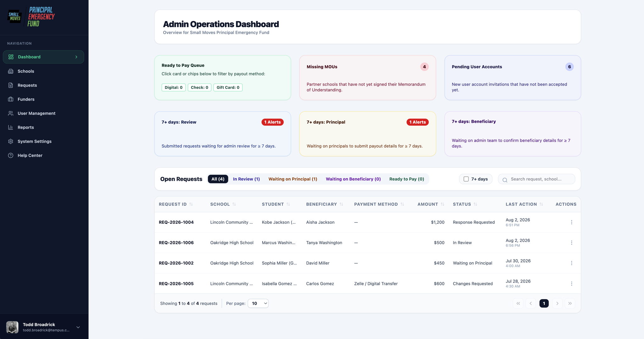
Same screen, same job. Different colour, density, and card structure — and the build added the 7-day alerts on its own.
What we let go
- Exact spacing, radii, and type scale
- Component-level fidelity to the spec
- A design system the build could read
What we protected
- Every status label and who-acts-next signal
- Hierarchy on the request and school records
- The state machine and every send-back path
- Onboarding step order and the fixes inside it
I'd make the same trade again. What was broken here was never the styling — it was that nobody could tell whose turn it was, and the data hung off the wrong object. Those survived.
The lifecycle changed too
Building it surfaced something the diagrams missed. Processing was doing two
jobs: "finance is fixing a payout detail" and "finance has a question for you." Same badge,
two different asks — so it split into Changes Requested and
Response Requested, each with its own button and resolution path. The same
who-acts-next principle, one level deeper than I originally took it.
Where it stands
Design approved, build underway. Since handoff I've worked alongside the CTO — QAing each release against the spec, deciding what ships in which order, and managing stakeholders.
- Aug 12, 2026Staging — first walkthrough with principals
- Aug 25 – Sept 1Cutover: close out requests, pull funder reports, migrate data
- Sept 1, 2026Principals go live for the 2026–27 school year
Three measures, readable within a term: walkthrough calls the ops lead has to run, days a request spends in Waiting on Principal, and whether finance stops double-checking by hand.
06 — Reflection
What I'd do differently
Read their documentation before the interview
I'd have spent the hour probing causes instead of collecting symptoms I already had on paper.
Run an explicit object-mapping session
The school-versus-principal insight was mine. An OOUX session would have made it theirs — and structural changes survive better when the team owns them.
Pin down the build toolchain during design
Knowing it would run on AI Studio with no Figma connection, I'd have traded high-fidelity frames for a written component and token spec the model could actually consume.
Get a beneficiary in the room
They confirm payment details and can request a change, but they're the only participant I designed for entirely secondhand — and their step is where a request can silently stall.