This case study is password-protected

Enter the password to view this project.

← Back to home

Internal platform, 0→1 · Tempus Gen AI ecosystem

Tempus One Internal: secure, in-house conversational AI for every employee

Tempus, a leader in AI-driven precision medicine, needed a secure internal AI platform so employees could draft engineering documentation, refine presentation decks, and summarize data without proprietary information leaving the building. The brief: an assistant intuitive enough for the whole company, defaulting to familiar GPT functionality while plugging into Tempus-specific AI agents.

Company
TempusAI-driven precision medicine
Role
UX DesignerRequirements → prototyping → usability testing
Designed for
All Tempus employees~80% basic tier · 20% advanced
Testing
12 usersUsability testing, coded into themes
Tempus One Internal · Case study

Summary

One assistant, built to be simple for 80% of the company on day one

12employees in usability testing
2competing prototypes tested for validation
80/20basic vs. advanced user split targeted

The goal was an intuitive AI platform for every Tempus employee — one that defaults to GPT functionality out of the box, integrates seamlessly with Tempus-specific AI agents, and keeps proprietary data handled securely throughout. It shipped as Tempus One Internal: empowering innovation with secure, in-house conversational AI.

I worked the problem from requirements through usability testing: brainstorming user types with Engineering, pitching the resulting segmentation to leadership, building and testing two competing prototypes, and coding twelve rounds of usability feedback into the themes that shaped the shipped design.
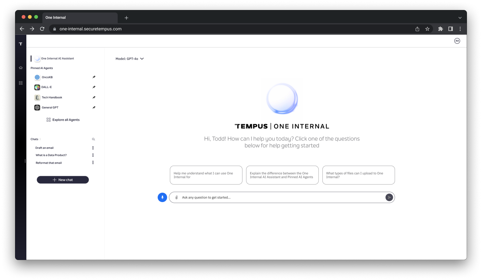
The live Tempus One Internal home screen: a GPT-4o model selector, pinned AI agents in the left rail, a Tempus One Internal orb logo, a personalized greeting with three suggested starter questions, and a voice-input icon beside the message field

01 — Defining the product

Two brainstorms, one reality check from the CTO

Before any screens, the team had to agree on who this was actually for. That took a joint brainstorm with Engineering, then a pitch to leadership to confirm the split held up.

Brainstorm: types of users and their needs

We ran brainstorming sessions with Engineering to identify the types of users who would interact with One Internal — and how much of the tool each type would actually need.
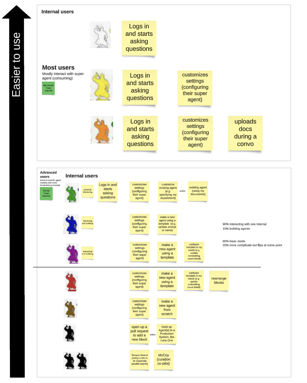
Affinity map of user types, labeled Easier to use along the left edge: Internal users who log in and ask questions, Most users who mostly interact with the super agent without a ServiceNow ticket, and Advanced users, color-coded by persona, who customize settings, build agents from templates or from scratch, and open pull requests to add new blocks
User-type brainstorm. Most users log in and ask a super agent questions — no ticket required. Advanced users customize settings, build agents from templates or from scratch, and some go as far as opening pull requests to extend the tool themselves.

Outcome

  • Most users — need to be able to ask questions to an LLM in a secure environment.
  • Advanced users — need to be able to adjust the settings and data sources of One Internal to suit their needs.

"We presented the outcome of the brainstorm with our CTO and they agreed on the users and needs, and provided business context that we should optimize One Internal for the most basic users — around 80% of our users — and 20% being advanced."

Pitch to leadership
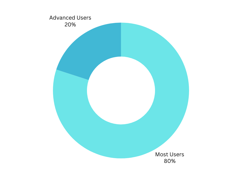
Donut chart splitting Tempus One Internal's user base: 80% Most Users, 20% Advanced Users
The 80/20 split leadership confirmed — the number the rest of the design had to answer to.

That split became a literal capability ladder: what a basic chat can do versus what requires stepping into agent building, laid out from the most casual entry point (a Slack conversation) to the most advanced (rearranging blocks, hooking an agent to a production system, or opening a pull request).
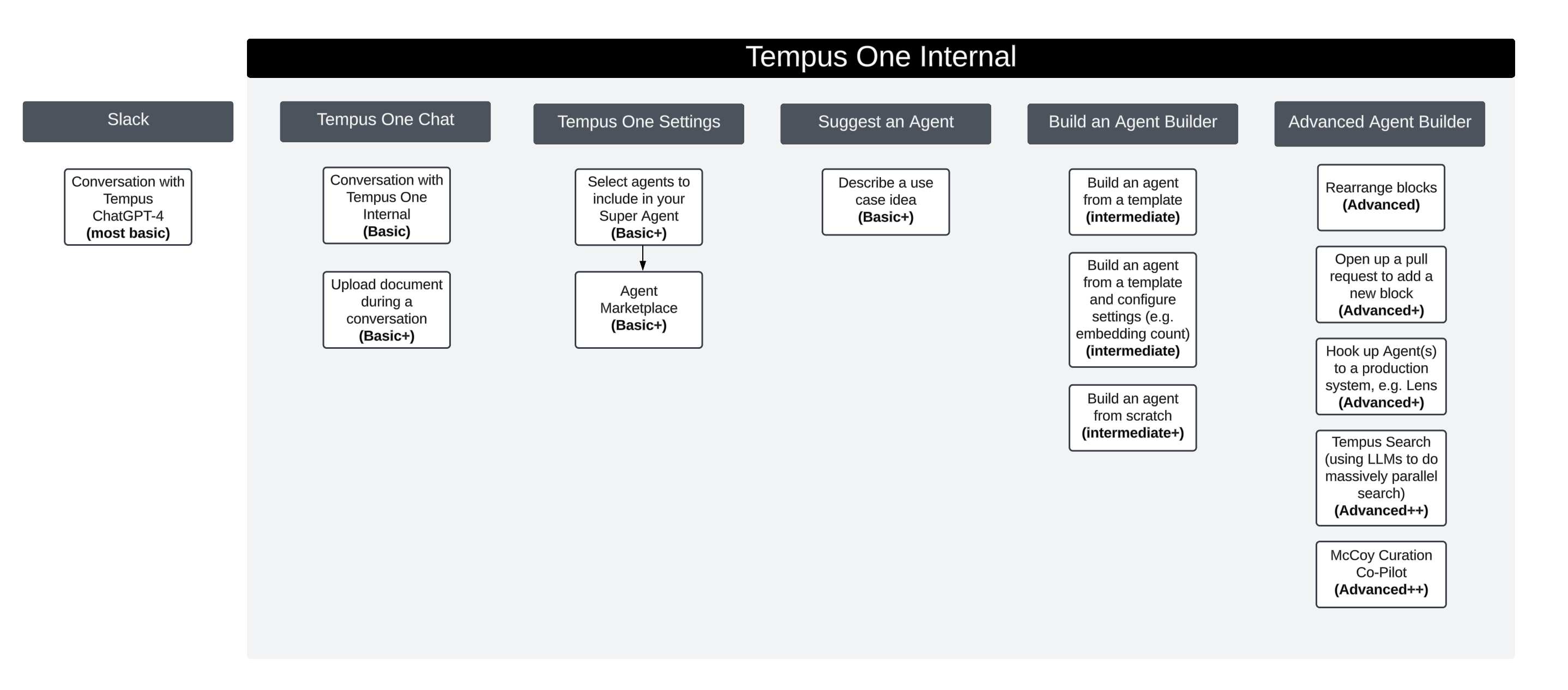
Capability-tier diagram spanning Slack, Tempus One Chat, Tempus One Settings, Suggest an Agent, Build an Agent Builder, and Advanced Agent Builder, with each action labeled Basic, Intermediate, Advanced, Advanced+ or Advanced++
Basic, intermediate, and advanced tiers. A plain chat conversation sits at Basic; rearranging blocks or wiring an agent into a production system like Lens sits at Advanced++.

Mocks and prototyping

From the tier map, I sketched the two entry points that mattered most for the 80% majority: the home-screen-to-chat path, and a lightweight way to ask for an agent that didn't exist yet.
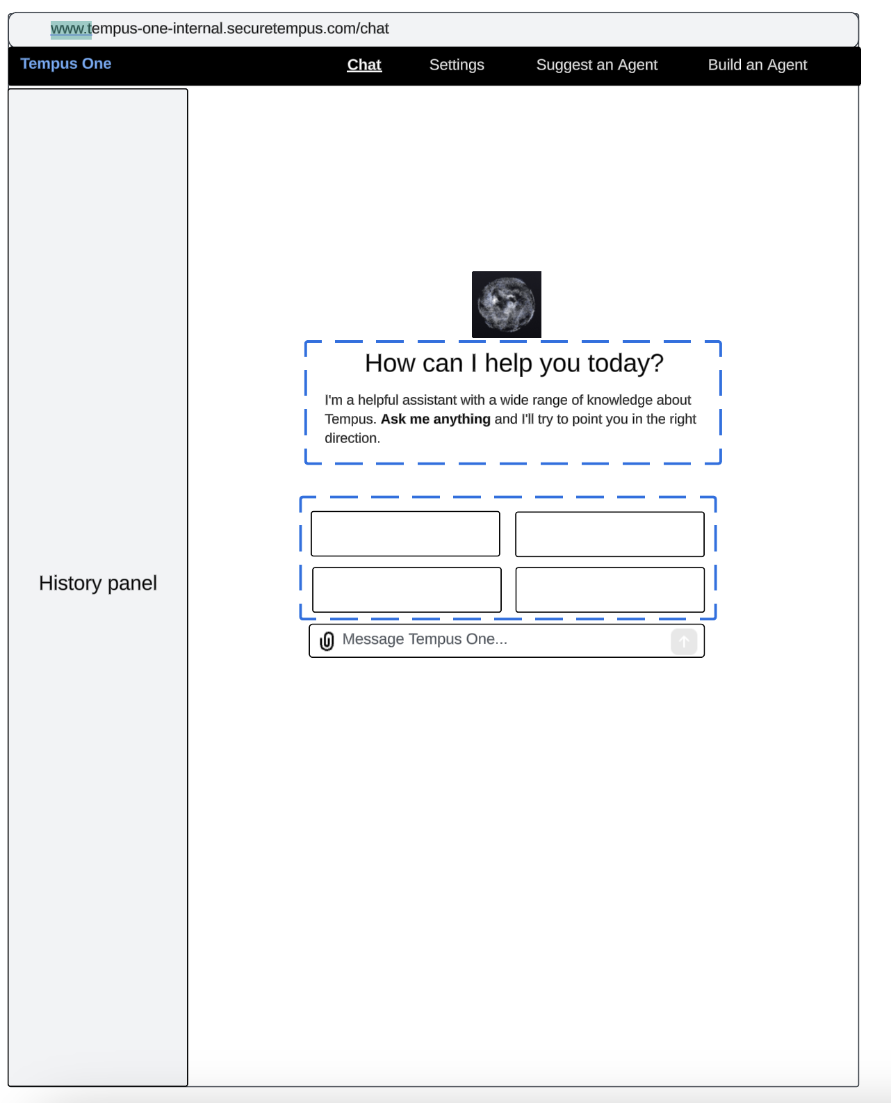
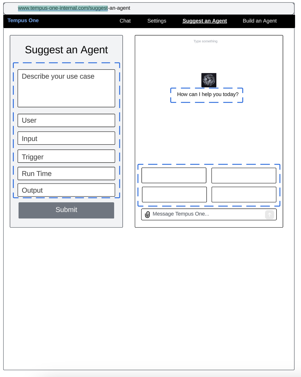
Wireframe of the home-screen-to-chat flow: a chat history panel on the left, a How can I help you today prompt in the center, and four placeholder suggested-question tiles above the message field
Home-Screen to Chat. A history panel plus suggested questions to get a first-time user typing immediately.
Wireframe of a Suggest an Agent form with fields for Describe your use case, User, Input, Trigger, Run Time, and Output, next to a chat preview panel
Suggest an Agent. A low-lift form for employees to propose an agent idea without needing to build it themselves.
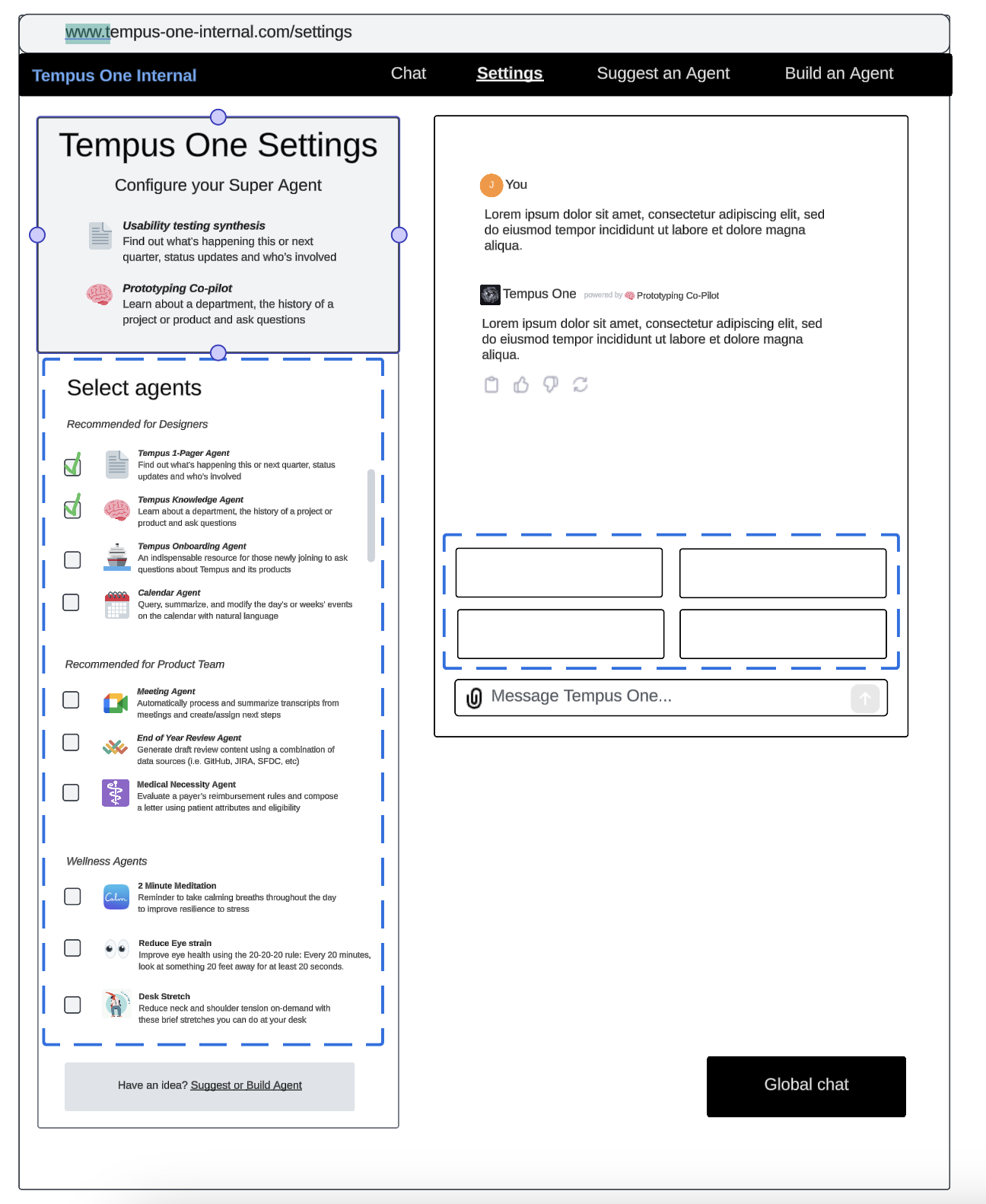
Wireframe of the Tempus One Settings screen, titled Configure your Super Agent, with a checklist of agents grouped under Recommended for Designers, Recommended for Product Team, and Wellness Agents, next to a chat preview reading powered by Prototyping Co-Pilot
Configuring the Super Agent. Employees check off which specialized agents they want folded into their own assistant — grouped by role, so the list itself does some of the recommending.

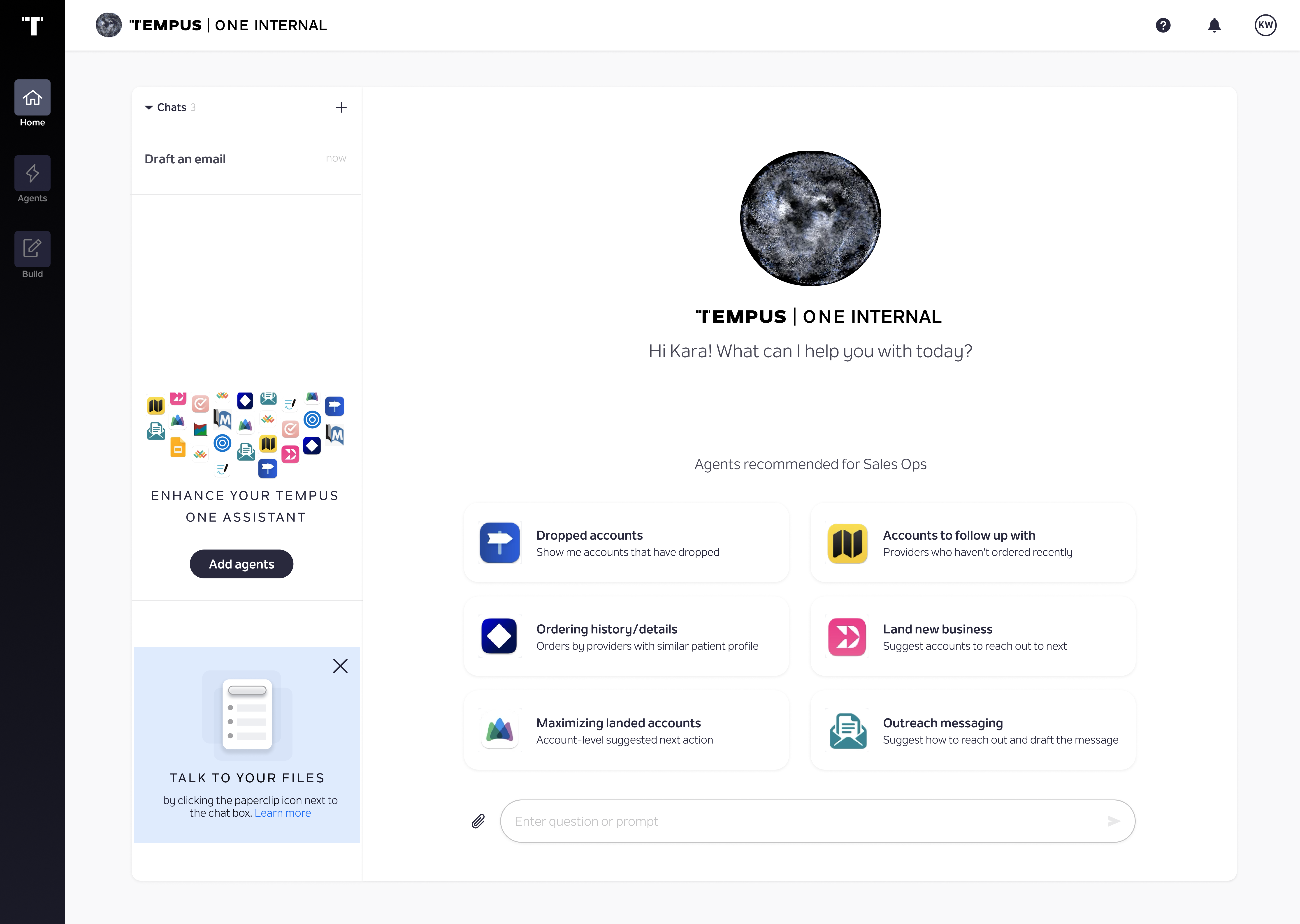
I created two different prototypes to test these concepts out with users in order to validate our ideas:
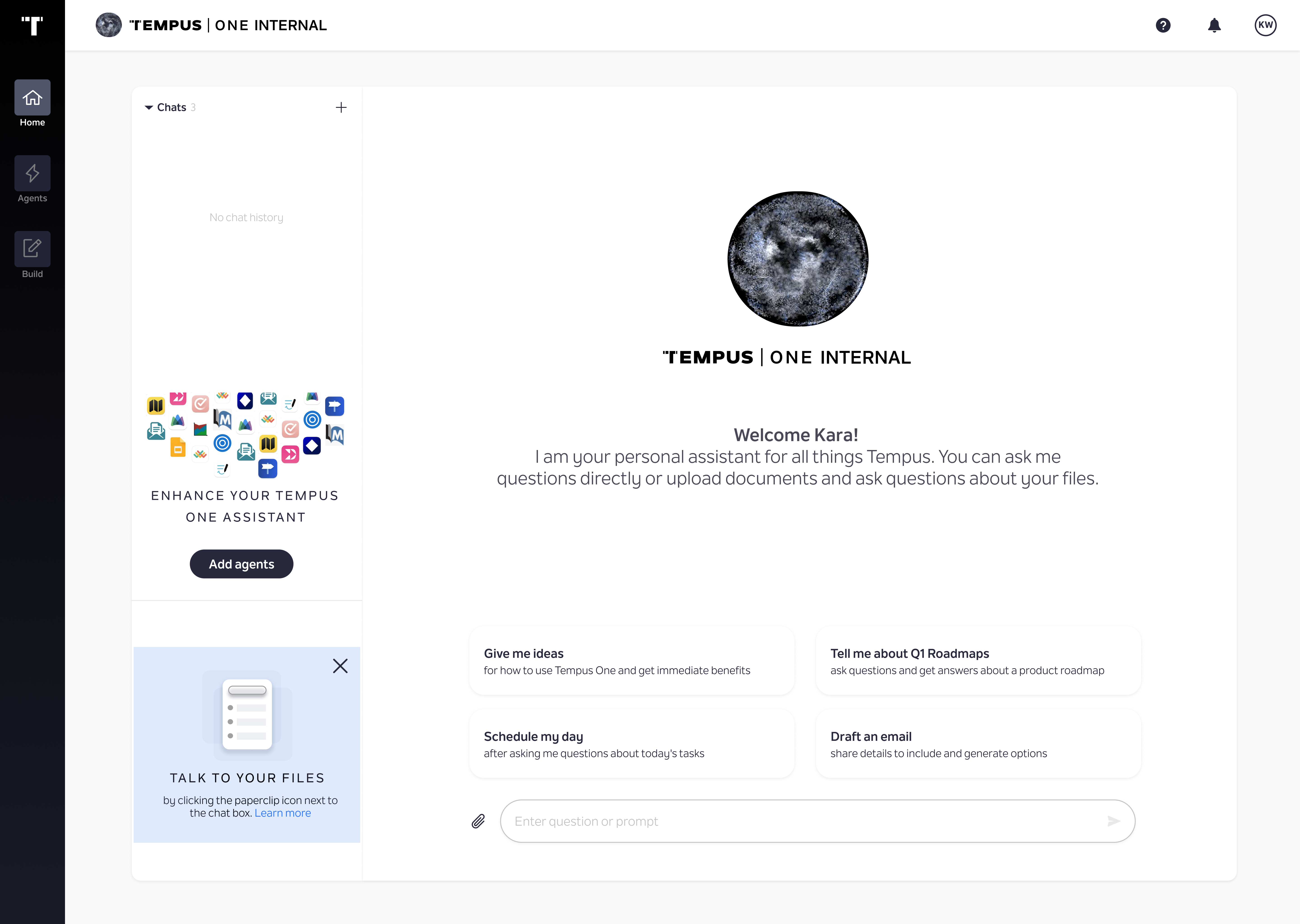
High-fidelity prototype version 1: a generic home screen greeting Kara with four suggested prompts — Give me ideas, Tell me about Q1 Roadmaps, Schedule my day, Draft an email
Prototype v1 — generic prompts, the same for every employee.
High-fidelity prototype version 2: the same home screen shell, personalized with agents recommended for Sales Ops, including Dropped accounts, Accounts to follow up with, Ordering history, Land new business, and Outreach messaging
Prototype v2 — role-personalized suggestions, here tailored to Sales Ops.

02 — Testing process

Twelve usability tests, coded into themes

Ran usability tests with 12 users and then coded themes where we saw them in the recorded transcripts.

The prompt behind every session

"What are your first impressions of the screen that we're showing you?"

Opening question, every usability session
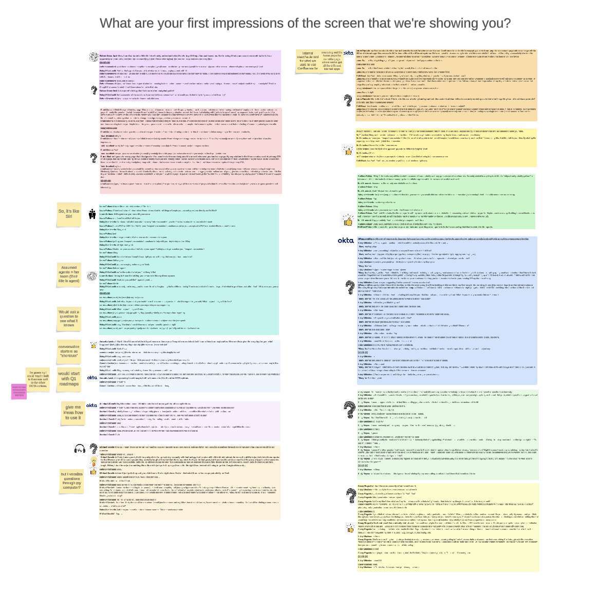
Affinity board of raw usability feedback with color-coded sticky notes clustering verbatim reactions, including So it's like Siri, Assumed agents = her team, Would ask a question to see what it knows, and but I realized questions through my computer?
Verbatim first reactions, clustered as they came in — including the one that stuck: "So, it's like Siri?"
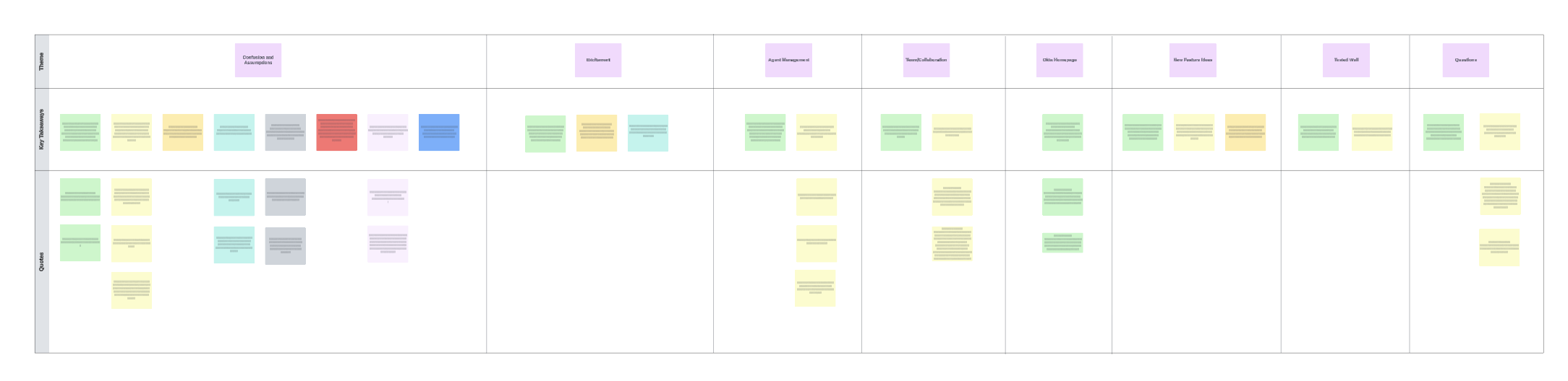
Synthesized affinity map organizing usability quotes and key takeaways into eight theme columns: Confusion and Assumptions, Entitlement, Agent Management, Team/Collaboration, Okta Homepage, New Feature Ideas, Tested Staff, and Questions
Raw reactions rolled up into eight themes. Confusion and Assumptions carried the most weight — and drove the how-might-we below.

Key takeaways — how might we

Users had confusion around: what an Agent is, why Agents appear directly on the homepage, and the concept of an "active" Agent and how it can be leveraged.

What we needed to address

  • Most users did not understand the concept of what an Agent is
  • Most users did not understand the reason for having Agents directly on the homepage
  • Most users did not understand the concept of an active Agent and how that can be leveraged

How we responded

  • Eliminate the need to understand what an Agent is upon first login
  • Make the homepage as simple and intuitive as possible to guide new users
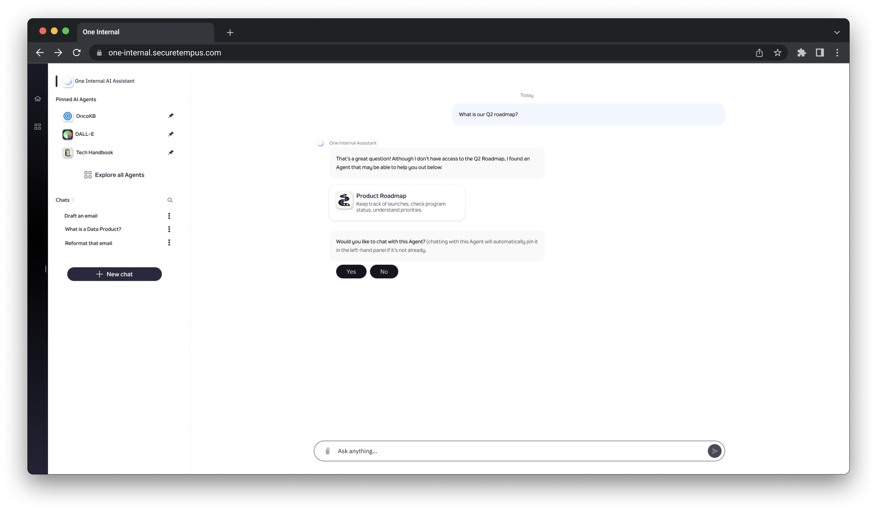
  • Eliminate the need to toggle an Agent on or off — just suggest a relevant one based on the question asked

03 — What shipped

Empowering innovation with secure, in-house conversational AI

The how-might-we above resolved into three concrete capabilities, then a revised homepage that put them all in one place.

Core capabilities — voice, categories, and getting suggested the right agent
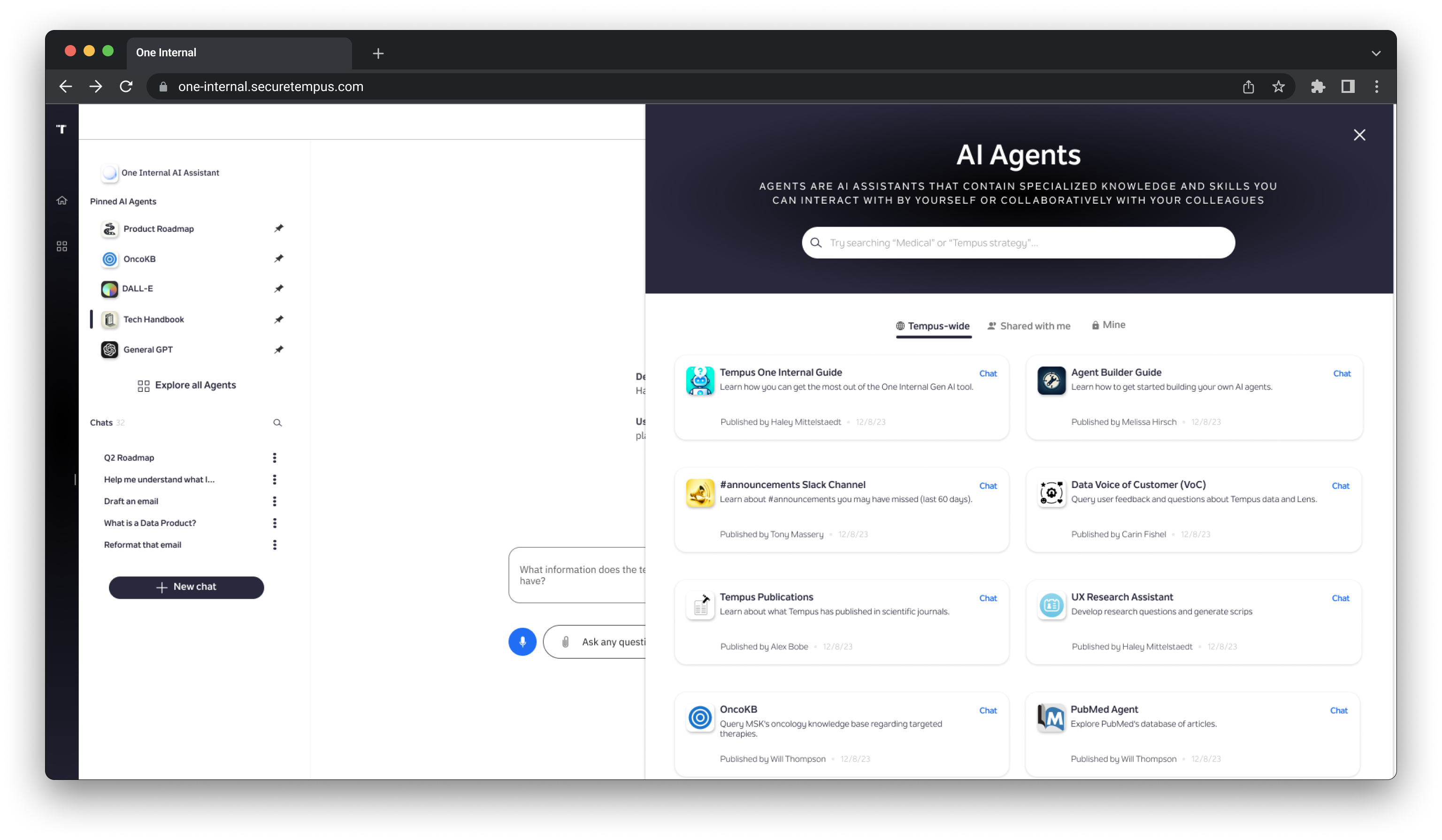
Revised homepage — the design that shipped
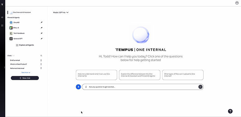
The revised, shipped Tempus One Internal home screen: pinned AI agents (OncoKB, DALL-E, Tech Handbook, General GPT) in the left rail, a recent chats list, a GPT-4o model selector, a personalized Hi Todd greeting, three suggested starter questions, and a voice-input icon beside the message field
Pinned agents and recent chats live in the same left rail as the basic conversation — so a new employee never has to leave the homepage to find either one.

04 — Impact

Usage metrics after 10 months
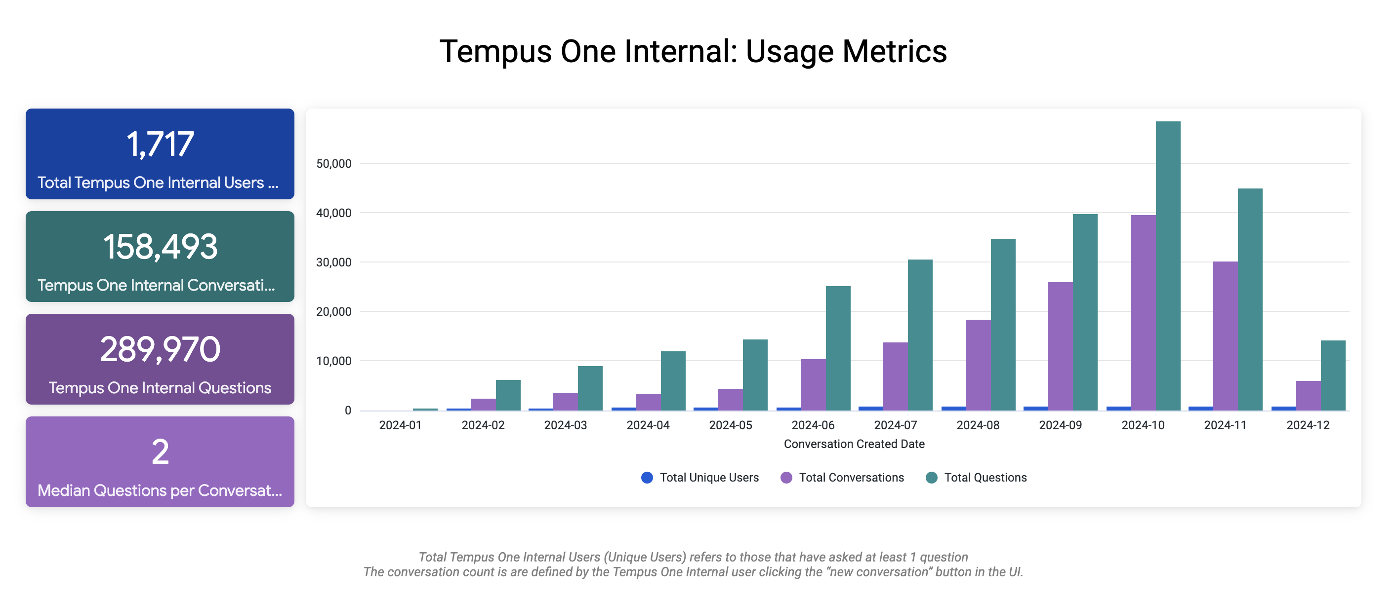
1,717total Tempus One Internal users
158,493Tempus One Internal conversations
289,970Tempus One Internal questions
2median questions per conversation
Bar chart titled Tempus One Internal: Usage Metrics, showing total unique users, total conversations, and total questions climbing month over month from January through December 2024
Steady month-over-month growth in unique users, conversations, and questions since launch.
Next project Principal Emergency Fund →